SaaS Cold Email Reply Rate Benchmarks (2026)
Published data puts average cold email reply rates between 3.4% and 8.5%. Here are the real benchmark bands for SaaS outbound and the levers that move them.
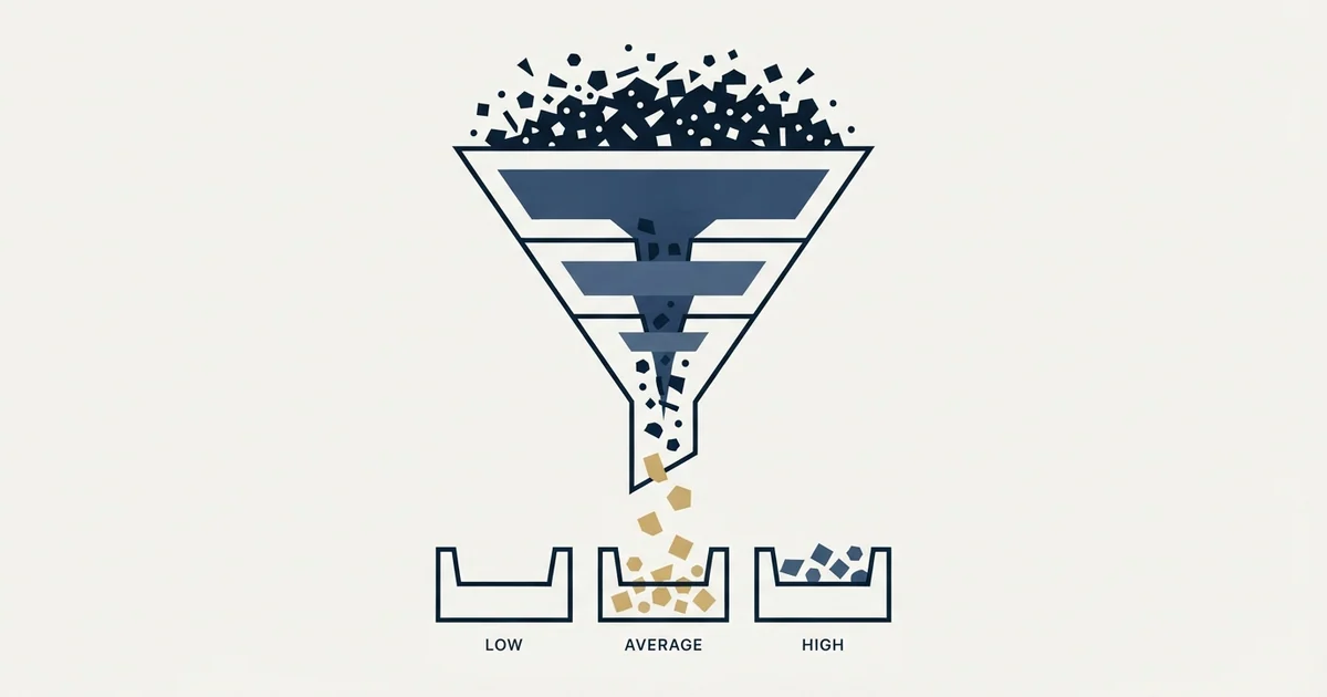
For SaaS cold outreach, published large-sample studies put average reply rates between 3.4% and 8.5%. Treat 4% to 8% as median, 8% to 12% as good, and above 12% as strong. Below 4% usually signals a list or persona problem rather than weak copy. Track positive reply rate separately.
Key takeaways
- Woodpecker's platform data shows a 3.43% average cold email reply rate, while Belkins' 2023 analysis of 11 million B2B emails reports 7% and Backlinko's 12-million-email study reports 8.5%. Belkins' current study, covering 7.5 million emails sent in 2025, reports 0.45% on a stricter per-send denominator: the same vendor, two live pages, an order of magnitude apart.
- QuickMail's analysis of 65 million email journeys found roughly 50% of campaigns reply under 10% and the top 25% clear 20%.
- No vendor publishes a clean SaaS-only reply rate cut, so any precise 'SaaS average' figure quoted to you is unsupported.
- A single follow-up increases replies by 65.8% (Backlinko). Belkins' 2023 statistics page found the third follow-up decreases reply rate by 20%, while its 2026 follow-up study found step 3 alone books more appointments than steps 1 and 2, so read the older figure as superseded. Both are Belkins' figures for multi-step sequences, which is not how we run campaigns: we send one message per campaign.
- Advanced personalization campaigns reply at 17% to 18% versus 7% to 9% for basic or no personalization (Woodpecker).
- List size compresses results: campaigns under 50 contacts average 5.8% replies against 2.1% for campaigns over 1,000 contacts (Woodpecker).
Reviewed and updated September 1, 2026
SaaS Cold Email Reply Rate Benchmarks (2026): What Good Looks Like
Two published numbers frame the entire spread of cold email performance. Woodpecker's platform data puts the average reply rate across its campaigns at 3.43%. QuickMail's analysis of 65 million email journeys found the top quartile of campaigns clearing 20% replies. Source: Woodpecker, QuickMail. Same channel, same tooling category, roughly a six-fold spread between the middle and the top.
For SaaS teams, that spread is the only benchmark that matters. Knowing the average tells you almost nothing about whether your campaign is fine or quietly broken, because the average pools campaigns that are well targeted with campaigns that are blasting 5,000 contacts scraped from a bad filter. What you actually need is a tier map: which band you are in, what typically causes that band, and what moves you up one rung.
What the Published Data Actually Says
Four large-sample studies are worth anchoring to. They measure slightly different things, which explains most of the apparent disagreement between them.
| Source | Sample | Avg open rate | Avg reply rate |
|---|---|---|---|
| Belkins | 11M B2B outreach emails | 36% | 7% |
| Woodpecker | 20M+ emails, platform data | 27.7% to 44% | 3.43% |
| Backlinko | 12M outreach emails | not reported | 8.5% response rate |
| QuickMail | 65M journeys, 1.7M emails | 44% | ~50% of campaigns under 10%; top 25% at 20%+ |
The Woodpecker figure is lower than the others because it is an unfiltered platform average across every campaign running on the tool, including abandoned and misconfigured ones. Belkins and Backlinko both measure campaigns that someone was actively managing. QuickMail reports distribution rather than a single mean, which is the most honest presentation of the four.
Woodpecker also publishes explicit tiers: 5% to 10% reply rate is "good" and above 10% is "excellent." Source: Woodpecker. Those thresholds line up well with the QuickMail distribution, where roughly a quarter of campaigns sit between 10% and 20%.
The SaaS Tier Map
No vendor publishes a clean SaaS-only cut of reply rate data. The industry breakdowns that do exist, including Woodpecker's analysis of 26,000+ campaigns, present the vertical splits as chart images without stated figures. Source: Woodpecker. Anyone quoting you a precise "SaaS average reply rate" to two decimal places is making it up.
What you can do is take the general B2B bands above and read them with SaaS-specific context. Selling software to software buyers means competing in the most saturated inboxes in B2B, so the practical read on each band shifts down slightly.
| Reply rate | Band | What it usually means for SaaS outreach |
|---|---|---|
| Under 2% | Broken | Deliverability failure, dead list, or wrong persona entirely |
| 2% to 4% | Below median | Generic copy and an over-broad ICP filter |
| 4% to 8% | Median | Working infrastructure, undifferentiated message |
| 8% to 12% | Good | Tight ICP, real relevance, follow-ups running |
| 12% to 20% | Strong | Narrow segment plus researched personalization |
| Above 20% | Outlier | Very small, very well qualified list, or warm-adjacent audience |
Two cautions on reading this table. First, reply rate counts every reply, including "unsubscribe me" and "wrong person." A 12% reply rate made up mostly of annoyance is worse than a 6% rate made up of curiosity. Track positive reply rate separately and treat it as the real number. Second, the bands compress as list size grows. Woodpecker's data shows campaigns under 50 contacts averaging 5.8% replies against 2.1% for campaigns over 1,000 contacts. Source: Woodpecker. A 10% reply rate on 80 contacts and a 10% reply rate on 3,000 contacts are not the same achievement.
What Drags SaaS Reply Rates Down
Buyer saturation at the exact titles you want. VP Engineering, Head of RevOps, and CTO at venture-funded software companies are the most heavily prospected titles in B2B. Every seed-stage tool with an Apollo seat is emailing them. The dynamic is self-reinforcing: the more your ICP overlaps with the market's default ICP, the more your reply rate regresses toward the platform average regardless of how good your copy is.
Deliverability decay that looks like a copy problem. Reply rate falls when messages land in spam, and the symptom is indistinguishable from bad messaging if you only watch replies. QuickMail reports an average bounce rate of 7.5% with a target of 4% or less, and Woodpecker puts the platform bounce average at 5.1% with "good" under 2%. Source: QuickMail, Woodpecker. If your bounce rate is above 5%, fix that before touching a single line of copy.
Feature-first positioning. SaaS sellers know their product deeply and instinctively open with what it does. The recipient has no context for why that matters at their company this quarter. Woodpecker's data shows personalized campaigns achieving nearly twice the reply rate of non-personalized ones, and campaigns using advanced personalization (custom snippets beyond first name and company) landing in the 17% to 18% range against 7% to 9% for basic or no personalization. Source: Woodpecker.
Motion mismatch. A product with a self-serve $29/month tier being sold via cold email to enterprise CIOs will underperform on replies no matter how well written the email is, because the buyer's mental model of "software I evaluate through a rep" does not include your price point. Match the outreach motion to the deal size before optimizing anything else.
Single-touch campaigns. More than half of replies arrive after the first email. QuickMail found 55% of replies originate from follow-ups, and Backlinko's 12-million-email study found a single follow-up boosts replies by 65.8%. Source: QuickMail, Backlinko. Teams that send one email and stop are reading a benchmark that is structurally half of what it could be.
Levers That Move the Number
The published data is fairly consistent about which changes produce the largest deltas. Ranked roughly by effect size:
| Lever | Reported effect | Source |
|---|---|---|
| Add a first follow-up | +65.8% more replies | Backlinko |
| Advanced personalization vs. basic | 17% to 18% vs. 7% to 9% reply rate | Woodpecker |
| Contact 2 to 4 people per account | Above 7% reply rate; +93% response vs. single contact | Belkins, Backlinko |
| Shrink the list | 5.8% under 50 contacts vs. 2.1% over 1,000 | Woodpecker |
| Personalize the email body | +32.7% response rate | Backlinko |
| Personalize the subject line | +30.5% more responses | Backlinko |
| Wait 3 days between follow-ups | +31% reply rate vs. other intervals | Belkins |
Two findings deserve emphasis because they cut against common practice.
Follow-ups have a sharp point of diminishing returns. Belkins found the first follow-up lifting replies by 49%, the second adding only 9%, and the third actually decreasing reply rate by 20%. Source: Belkins. Woodpecker similarly identifies 2 to 3 follow-ups as the peak. Source: Woodpecker. The nine-step sequence is costing you replies, not earning them.
Follow-up timing matters more than most teams assume. Belkins reports that following up within one day hurts reply rates by 11% and waiting longer than five days reduces response likelihood by 24%. Source: Belkins. The three-day gap is a cheap fix that requires no copy work at all.
Multi-threading is the most underused lever in SaaS specifically, because software purchases involve a technical evaluator, an economic buyer, and usually a security or procurement gate. Belkins found C-level recipients replying about 20% more often than non-C-suite staff (6.4% against 5.2%), which is a smaller gap than most reps expect. Source: Belkins. Reaching down and across the org chart costs you very little in reply rate and gains you enormously in coverage.
How to Read Your Own Numbers
Diagnose in funnel order. Each metric gates the one below it, and fixing a downstream problem while an upstream one is live wastes weeks.
| Symptom | Likely cause | First action |
|---|---|---|
| Bounce rate above 5% | Stale or unverified list | Re-verify; pause the domain if above 8% |
| Open rate below 25% | Deliverability or spam placement | Seed test, check DNS records, reduce daily volume |
| Open rate healthy, reply under 2% | Wrong persona or irrelevant offer | Re-cut the ICP before rewriting copy |
| Reply 4% to 8%, mostly neutral | Undifferentiated message | Rebuild the first line around a researched trigger |
| Good reply rate, few meetings | Weak or oversized ask | Reduce the ask; offer async value instead of a demo |
| Reply rate falling over weeks | Domain reputation decay | Rotate inboxes, warm up, cut sending volume per mailbox |
Then check whether your number is real. Reply rate is a proportion, and small samples produce wildly unstable estimates. At a true 5% reply rate, 200 sends produce a 95% confidence interval of roughly 2% to 8%. At 1,000 sends, that interval narrows to roughly 3.7% to 6.4%. In practice, treat anything under about 400 sends per variant as directional at best, and never kill a message based on 100 emails.
Finally, convert to the unit that pays the bills. Belkins puts the volume needed to generate one lead at roughly 306 cold emails. Source: Belkins. Work backwards from your pipeline target using your own positive-reply-to-meeting and meeting-to-opportunity rates rather than benchmarking on replies alone. A campaign at 6% replies with a 40% positive-reply share beats a campaign at 11% replies where most of the responses are polite refusals.
Where we differ from standard practice
Much of the advice on this page reflects how outbound is commonly run. We run it differently, and since this page sits on our site it is worth saying where the difference is and what it costs us.
- A sequence of messages to each prospect over several weeks
- Later messages often land in the same email thread
- Every contact is reached more than once, so a distracted reader gets another chance
- The later messages go only to people who did not answer the first
- Reputation cost accrues on the sending domain across everything else it sends
- One message, then that campaign is finished for that contact
- No thread replies and no bumps
- A non-responding audience becomes a new campaign with a genuinely different premise, not a reminder
- More of the work moves into targeting and into the one message
- We reach each contact less often, and that is the cost we accept
The reasoning is mechanical rather than moral. A follow-up arrives underneath a message the recipient has already seen and chosen not to answer, so it is delivered to the population most likely to mark it as spam, and the reputation cost of that lands on the sending domain across every campaign running on it. We set that cost against the replies a sequence recovers and decided the trade was not worth it. The full argument, with the numbers from our own campaigns, is in why we stopped using follow-ups.
Setting a Target You Can Actually Hit
For a SaaS company running structured outbound to a well-defined ICP with verified data, follow-ups in place, and clean deliverability, 6% to 10% total reply rate with 2% to 4% positive replies is a realistic steady state. Above that band, expect to trade volume for quality: the campaigns clearing 15% are almost always running lists in the low hundreds with genuine per-account research. Below 4%, the problem is nearly always list quality or persona fit rather than copy, and no amount of subject line testing will fix it.
Set the target before the campaign launches, instrument positive reply rate from day one, and re-baseline quarterly. Inbox saturation in software keeps rising, so a benchmark you set two years ago is describing a market that no longer exists. At RevenueFlow we re-baseline client targets every quarter for exactly that reason.
If you would rather have the infrastructure, list building, and campaign testing handled for you instead of rebuilding it in-house, book a strategy call and we will map your current numbers against these bands and show you which lever is worth pulling first.
Related Reading
- Legal Services Cold Email Reply Rate Benchmarks (2026): What Good Looks Like
- Real Estate Cold Email Reply Rate Benchmarks (2026): What Good Looks Like
If you would rather have this run for you, RevenueFlow books qualified meetings on a pay-per-meeting basis and publishes client results.
Benchmark figures cited from publicly available studies by Belkins, Woodpecker, Backlinko, and QuickMail. Verified as of July 2026. Sample sizes and methodologies differ between studies; compare tiers rather than exact figures.
Frequently asked questions.
Frequently asked questions- What is a good reply rate for cold email to SaaS companies?
- Treat 4% to 8% as median performance, 8% to 12% as good, and above 12% as strong. Woodpecker explicitly labels 5% to 10% as good and above 10% as excellent across its platform data. Anything under 4% on a well-targeted list usually points at deliverability or persona fit rather than copy quality.
- Why is my cold email reply rate so low even though open rates look fine?
- Healthy opens with replies under 2% almost always means the offer is irrelevant to the person receiving it, not that the writing is weak. Re-cut your ICP filter and confirm the title actually owns the problem you solve before rewriting copy. Also verify bounce rate sits under 5%, since inflated opens can mask spam placement.
- How many cold emails do I need to send before the reply rate means anything?
- At a true 5% reply rate, 200 sends give a 95% confidence interval of roughly 2% to 8%, which is too wide to act on. At 1,000 sends the interval narrows to about 3.7% to 6.4%. Treat anything under 400 sends per message variant as directional only, and never kill a campaign on 100 emails.
- What do published studies say about follow-up counts in SaaS outbound?
- They disagree, and all of them measure market practice rather than ours. Backlinko found a single follow-up boosts replies by 65.8%, and Woodpecker identifies 2 to 3 follow-ups as the peak. Belkins' 2023 statistics page found the second follow-up adds only 9% and the third reduces reply rate by 20%. We send one message per campaign and re-approach a non-responding list only as a new campaign with a different premise.
- Should I measure reply rate or positive reply rate?
- Positive reply rate is the number that predicts pipeline. Total reply rate counts unsubscribes, referrals to the wrong person, and outright refusals. A campaign at 6% replies where 40% are positive outperforms one at 11% replies made up mostly of polite declines. Track both, but set targets on positive replies and meetings booked.
About the author.

Hosun Chung is COO at RevenueFlow, which builds and operates outbound revenue engines for B2B companies. Previously at Gleacher Shacklock LLP. Studied at London School of Economics.
Hosun Chung · COO
Connect on LinkedIn →Explore more.
Ready to scale your outreach?
We build GTM engines that book real meetings. See the receipts.
Related articles.
Real Estate Cold Email Reply Rate Benchmarks (2026)
No vendor publishes a real estate cold email benchmark. Here are the published reply-rate tiers that do apply, and how to read your own results.
Legal Services Cold Email Reply Rate Benchmarks (2026)
Cross-industry cold email reply rates average 3.43%. Here is what good looks like when your list is law firms, plus the levers with real data behind them.
Cold Email Conversion Benchmarks: 2026 Performance Data
Complete benchmark data for cold email conversion rates from reply to meeting to opportunity. Learn what drives conversions and how to optimize your full funnel.
Education Cold Email Benchmarks: 2026 Performance Data
Industry benchmark data for education cold email campaigns, including open rates, reply rates, and conversion metrics for companies targeting K-12 schools, higher education, and corporate training organizations.
Automotive Cold Email Benchmarks: 2026 Performance Data
Industry benchmark data for automotive sector cold email campaigns, covering OEMs, suppliers, dealerships, and automotive technology with performance metrics by segment and buyer role.
Real Estate Cold Email Benchmarks: 2026 Performance Data
Comprehensive benchmark data for real estate cold email campaigns, including open rates, reply rates, and conversion metrics for companies targeting brokerages, property managers, developers, and real estate investors.