Lead Generation Statistics: The Denominator Nobody States
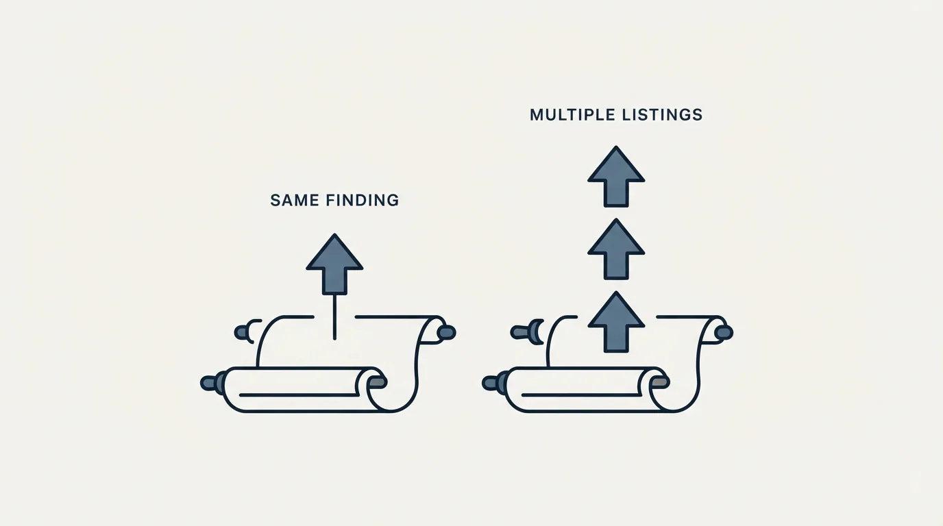
One roundup lists the same budget statistic twice in different words, and three list one finding under three different attributions. The genre explains itself.
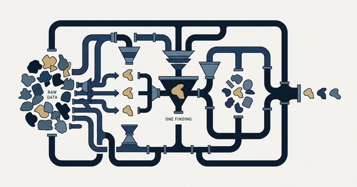
Most published lead generation statistics omit the population they counted, and the word lead covers everything from a demo request to a scraped name. Follow the attribution rather than the number, check the study year rather than the article year, and prefer figures whose dataset is named in the same sentence.
Key takeaways
- WebFX's page carries the same budget finding twice in different wording, both counted toward a headline promising 40 or more statistics, which is what a format built around a count does to the people producing it.
- One finding appears on three pages as 80%, 79% and 79% with three different attributions, and one of the three adds the condition "without proper nurturing", turning a description into an argument for buying software.
- Identical figures with different sources are the tell: Martal credits DemandSage and Callbox credits HubSpot for the same 61% quality-of-leads finding, so at least one is quoting an intermediary without saying so.
- Two shapes are worth trusting: first-party research the publisher ran and names, such as Sopro's State of Prospecting survey, and figures stating their dataset inline, such as a median conversion rate based on analysis of over 100 million data points across 14 industries.
Reviewed and updated August 28, 2026
WebFX's lead generation statistics page carries the entry "53% of marketers spend at least half of their budget on lead generation". Further down the same page, it carries "53% of marketers say half or more of their budget goes to lead generation". Same figure, same page, counted twice toward a title that promises 40 or more statistics.
That is not dishonesty. It is what the format does to the people who produce it. A page whose headline is a count has an incentive to reach the count, and the fastest route to the count is to restate what is already there or to lift what is already somewhere else. Once you know that, these pages become genuinely useful, just not in the way they are meant to be read.
The missing half of almost every figure
Lead generation trends pieces are the same figures with a year attached, and they inherit the same problem: a trend claim needs the denominator stated twice, once for each year being compared.
Take the most republished statistic in the category. WebFX's page says 80% of new leads never turn into sales. Martal's page says about 79% of leads never convert into sales, attributing it to Salesforce and MarketingSherpa. Callbox's page says 79% of leads never convert to sales without proper nurturing, attributing it to data compiled by FreJun.
Three pages, three renderings of what is recognisably one finding, and three different attributions. The versions differ in ways that matter more than the one percentage point between them. One of them added a condition, "without proper nurturing", which turns a description into an argument for buying nurture software. None of them says what a lead was. Nothing in any of the three tells you whether the population was inbound form fills, list-purchased contacts, event scans or an aggregate across all of them, and the number means something completely different in each case.
A form fill from a pricing page and a name scraped from a conference attendee list are both called leads. If 79% of the second group never converts, that is unremarkable. If 79% of the first group never converts, something is badly wrong. One statistic cannot carry both readings, and the published version does not say which one it holds.
- An inbound form fill on a pricing or demo page
- A content download behind a gate
- A name on a purchased or scraped list
- A badge scan at a trade show
- An account showing third-party intent data
- Intent varies from explicit request to no awareness at all
- Volume differs by two orders of magnitude between the extremes
- A high non-conversion rate is expected in some of these and alarming in others
- Blending them produces an average that describes none of them
- Publishers rarely state the mix because their sources rarely did
Reading the attribution chain instead of the figure
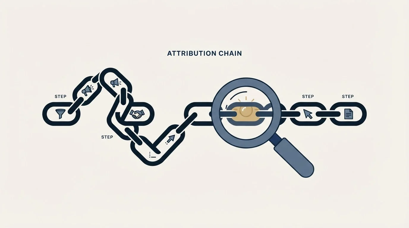
The useful exercise on one of these pages is to follow the citations rather than collect the numbers.
Martal's page states that 61% of companies call generating quality leads their biggest challenge and credits DemandSage. Callbox's page states that 61% of marketers say generating high-quality leads is their single biggest challenge and credits HubSpot's State of Marketing 2026. The number is identical. The attributed source is not. At least one of those pages is citing an intermediary that cited someone else, and a reader cannot tell which from either page.
This is the structural weakness of the genre. Each page is a compilation, several of its sources are themselves compilations, and the further a figure travels from the survey that produced it the more the wording drifts and the more the qualifiers fall off. By the third hop, a finding about a specific sample in a specific year is a bare sentence with a percent sign, and its year is now the year of the page you are reading.
The same test applied to the wider category, and the handful of publishers whose sales statistics arrive with their own research, their population and their year attached, is in who ran the survey.
Two counter-examples on the same set of pages show what a usable figure looks like.
Sopro publishes lead generation statistics drawn from its own State of Prospecting survey, and says so throughout. Its figures include the finding that 67% agree deliverability is a major barrier to success. That figure is first-party: one organisation ran a survey, published the result, and is quoting itself. You still need the sample and the method to weigh it, but the chain is one link long and the link is named.
Callbox's page carries a figure with the denominator attached in the sentence: a median B2B website conversion rate of 2.9%, "based on Ruler Analytics' analysis of over 100 million data points across 14 industries". Whatever you think of the number, you know what was counted, by whom, and across how much. That is one sentence longer than the alternative and it is the difference between a statistic and a decoration.
- Depends: The population is named, not just the metric
- Depends: The original study is named, not the page that reprinted it
- Depends: The study's own year is given, separate from the article's year
- Depends: A sample size, period or dataset scale appears somewhere reachable
- Depends: The publisher does not sell the remedy the figure implies
- Depends: The figure appears once on the page rather than twice in different words
Where the incentive sits
Every page in this SERP is published by a company that sells lead generation, prospecting data or the software around it, and this article is on the site of an agency that sells outbound. That is worth saying out loud rather than pretending otherwise, because it predicts which figures get republished.
Statistics that describe a problem the publisher solves travel furthest. A figure about the share of leads that never convert sells nurturing. A figure about the share of marketers who struggle with quality sells better data. A figure about buyers already having a shortlist sells brand and intent tooling. None of that makes the underlying research wrong. It does mean the corpus of republished statistics is a filtered sample of the research, selected for commercial usefulness rather than for representativeness, and the filtering happens invisibly at every hop.
The practical consequence is that these pages are decent for finding out what an industry currently wants to be true, and poor for finding out what is true.
There is a second filter running alongside the commercial one, and it selects for figures that cannot be checked. Martal's page states that the lead generation industry is projected to reach $295 billion by 2027, crediting Business Wire. A projection is not a measurement, its 2027 horizon means it will never be settled by anything a reader can observe, and the definition of the industry being sized is doing most of the work in the number. Figures like that survive in roundups because nothing can dislodge them: there is no year in which somebody checks. A measured figure, by contrast, ages visibly and eventually embarrasses the page carrying it, which is exactly why the measured ones are worth more.
The numbers you can actually get for free

The reason any of this matters is that a borrowed benchmark is usually solving a problem you could solve with your own data.
Consider what a published conversion statistic is for. It is a yardstick: you want to know whether your own number is normal. But your own number is available, it is measured on your actual population, and it does not need a denominator disclosure because you built the denominator. The comparison a borrowed figure offers is only meaningful if the two populations match, and you cannot check that, because the published one is undescribed.
A related limitation appears when teams turn to AI to shortcut that denominator work: the lead generation jobs it can safely handle draws a firm line between drafting and supplying unverifiable facts.
Here is illustrative arithmetic, invented to show the shape of the problem rather than to report anything measured. These figures are invented and are not results of ours or anyone else's. Suppose you contact 2,000 companies in a quarter and 40 reply positively. That is 2%. Whether 2% is good depends entirely on how tight the target definition was: 2% against a broad list and 2% against a list of 2,000 companies that all match a narrow, evidenced profile are opposite outcomes, because the second list should have produced more. No industry average can tell you which situation you are in, and your own quarter-on-quarter series can.
The two internal comparisons worth building before you reach for anyone else's figure are the same period last quarter, and one segment against another inside the same campaign. Both are free, both are measured on your population, and both survive the objection that ends every argument about a published benchmark, which is that you do not know what it counted.
For the outbound-specific version of that measurement, with both ends of each transition named, the conversion rate entry sets out the five separate conversions an outbound motion contains. What the acquisition arithmetic looks like once those rates are yours is in cost per lead in B2B, and the channel-level framing is in lead generation channels. Where our own benchmark pages publish figures, they are third-party figures with their sources named, on the same principle as this page: cold email open rate benchmarks is the closest neighbour.
The short version
A lead generation statistic without a stated population is unreadable, because the word "lead" covers everything from an explicit demo request to a scraped name, and the same percentage means opposite things across that range.
Follow the citation rather than the number. Identical figures with different attributions are common in this genre, which means at least one page in every such pair is quoting an intermediary without saying so, and the study's real year is usually older than the page implies.
Prefer first-party figures where the publisher ran the survey and says so, and figures that state their dataset in the same sentence. Both exist in this SERP and both are rarer than the alternative.
Then stop shopping for a yardstick and build one, because your own quarter-on-quarter and segment-on-segment comparisons are measured on the population you actually contact. If you would like to see what that population looks like for your market before you spend anything, we will build a campaign and show the reasoning.
Organic search's role in lead generation explains why that kind of channel needs a criterion and a date fixed before publishing rather than a borrowed benchmark.
Third-party figures above were verified against the publishers' own pages as fetched on 16 August 2026. Verify current figures at the source before relying on them.
Sources: WebFX, 40+ Lead Generation Statistics, Martal, Lead Generation Statistics 2026, Callbox, 80+ B2B Lead Generation Statistics, Sopro, 67 Lead Generation Statistics and Trends for 2026
Frequently asked questions.
Frequently asked questions- Why do lead generation statistics never say what a lead is?
- Because the sources they were copied from usually did not either. An inbound demo request, a gated download, a purchased contact and a trade-show badge scan are all called leads, and their conversion economics differ by orders of magnitude. A blended figure describes none of them, and by the third republication the qualifier that would have told you is gone.
- Is the statistic that 79% of leads never convert reliable?
- It is republished more than it is measured. Three pages carry it as 80%, 79% and 79% with attributions to Salesforce and MarketingSherpa, to data compiled by FreJun, and to nothing traceable. None states the population. Treat it as a widely shared belief about lead quality rather than as a benchmark you can hold your own numbers against.
- Which published lead generation figures are worth citing?
- Two kinds. First-party research where the publisher ran the survey and says so, as Sopro does throughout its statistics page with its State of Prospecting survey. And any figure that names its dataset in the same sentence, such as a median conversion rate reported as an analysis of over 100 million data points across 14 industries. Both make the chain checkable.
- What should I benchmark against instead?
- Your own two comparisons, because both are measured on the population you actually contact. Compare this quarter to last quarter, and compare one segment against another inside the same campaign. Neither needs a denominator disclosure from a stranger, and both survive the objection that ends every argument about a published benchmark, which is that you cannot see what it counted.
About the author.

Ben Carden is CRO at RevenueFlow, which builds and operates outbound revenue engines for B2B companies. Previously at Gartner Enterprise. Studied at London School of Economics.
Ben Carden · CRO
Connect on LinkedIn →Explore more.
Ready to scale your outreach?
We build GTM engines that book real meetings. See the receipts.
Related articles.
Lead Verification: What Each Check Actually Proves
Lead verification covers two different jobs. One asks whether a mailbox will accept mail, the other asks whether the person behind the row is real and lawful to contact.
Average Landing Page Conversion Rate: What It Measures
Four published answers to one question span more than four to one. What each dataset actually counted, and why none of them applies to a page fed by cold outbound.
ABM vs ABX: What Demandbase Added to the Model
One of these terms belongs to a vendor. What Demandbase says ABX adds, the three things that genuinely change, and the three that stay identical.
Drift Competitors: What Replaced It and What Each Costs
Drift is retired and drift.com now serves a Salesloft page. What the successors publish about price, who owns them now, and which one fits which job.
Typeform Alternatives: Read the Response Meter First
Typeform meters responses with a hard ceiling and counts seats inside the plan. What Tally, Fillout, Formbricks and Jotform count instead, from their own pricing pages.
B2B Database: What to Test Before You Pay
Total record count is the number every vendor leads with and the one that predicts least. The test that replaces it takes a day and settles the purchase.