ABM Reporting: Three Readers, Three Cadences
ABM reporting built around who reads it: a weekly operating page, a monthly allocation page and a one-page quarterly board report, each computed from CRM fields.
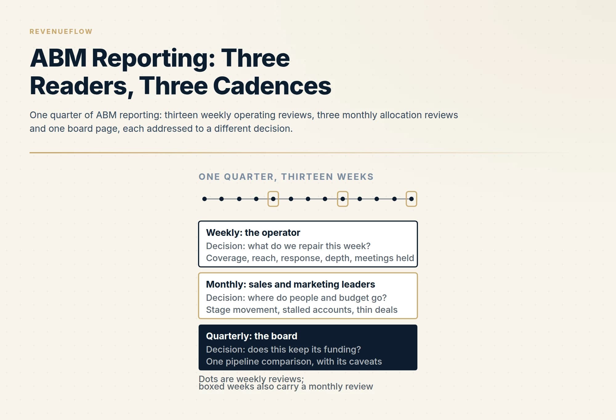
ABM reporting works when it is split by reader. The operator gets a weekly page of coverage, reach, response, depth and meetings held, each with a repair owner. Sales and marketing leaders get a monthly page of stage movement, stalled accounts and thin deals. The board gets one quarterly page comparing pipeline from target accounts with everything else.
Key takeaways
- One shared ABM dashboard fails because the operator, the revenue leaders and the board are each making a different decision at a different cadence.
- Every weekly number is a filtered CRM count once four fields exist: a target-account flag and tier, a buying-group role, a delivered status, and a held outcome on meetings.
- The quarterly board page carries one comparison, pipeline from target accounts beside everything else, followed by coverage, the held-back group and cost.
- Coverage is the only number that belongs on all three reports, because it qualifies every other figure wherever it appears.
Reviewed and updated September 18, 2026
The quarterly ABM deck has fourteen charts. Engagement is up, reach is up, influenced pipeline is up, and the meeting ends without anyone deciding anything, because nothing on the slides was addressed to a decision anyone in the room had to make. Three weeks later the same numbers, slightly larger, go into the next deck.
That is a reporting failure rather than a measurement failure. The numbers may be perfectly sound. Our guide to ABM metrics covers which ones are, why coverage has to be computed first, and why every rate should be reported against the accounts you can actually reach. This page starts where that one stops. It is about the report itself: who reads it, how often, what goes on the page in what order, and how each number is pulled from a CRM so that the person building it is not doing arithmetic in a slide tool at midnight.
What the published advice gets right, and where it stops
Two widely read guides set out the standard position. The Revenue Operations Alliance guide to ABM reporting, by Ella Harrison and dated May 20, 2026, says "The best account-based marketing dashboards tell a story, rather than just listing numbers", and argues that because ABM needs sales, marketing and leadership to collaborate, "your reporting dashboard should similarly give everyone a shared view." AdRoll's post on its ABM reporting template, last updated on December 30th, 2025, begins a step earlier: "The first step in ABM reporting is setting the stage for your stakeholders by clearly defining what the goals and KPIs of your campaigns were."
Both points are right. Agree the goals first, and do not hand people a wall of numbers. Where we part company is the shared view. A single dashboard for everyone assumes everyone is making the same decision, and they are not. The person running the programme decides what to repair this week. The heads of sales and marketing decide where people and budget go next month. The board decides whether the programme keeps its funding. One page cannot serve all three, and the usual result of trying is the fourteen-chart deck.
Three readers, three cadences, three decisions
Build the report around the decision each reader has to make, and the cadence follows from how often that decision can sensibly change.
The operator reads weekly. This is whoever runs the programme day to day, with the SDRs and the marketing owner. Their decision is what to fix now, so their page holds the operating numbers, each of which points at a specific repair.
The revenue leaders read monthly. Their decision is allocation: which tier or segment gets more effort, which accounts are stuck, which open deals are thin. A month is long enough for accounts to move between stages and short enough to change course inside a quarter.
The board reads quarterly. Their decision is whether to keep funding the programme. They need one comparison, the context that qualifies it, and what changes next.
The weekly page: five numbers, each with a repair attached
The operator's page holds five numbers in a fixed order: coverage, reach, account response, buying-group depth and meetings held. The definitions and the reason for the order are in the metrics guide and are not re-argued here. What matters for the report is that each number names the repair it triggers. A coverage gap is a data job. A reach gap is a deliverability job. A response gap is a problem with the argument or the list. A depth gap is research and outreach inside accounts already reached. A meetings gap, with response healthy, is a handoff problem.
Lay the page out so that each number sits beside last week's value, the four-week trend and the name of the person who owns the repair. Nothing else goes on it. A weekly page that needs scrolling has become a monthly page.
Every one of those numbers can come out of a CRM, provided four things exist as fields rather than as tribal knowledge: a target-account flag and a tier on the Account, a buying-group role and a verified-email flag on the Contact, a delivered status on logged outbound messages, and an outcome on meetings that separates held from booked. With those in place, each number is a filtered count.
| Number | Count this | Over this |
|---|---|---|
| Coverage | Target accounts with at least one contact holding a buying-group role and a verified email | All accounts carrying the target-account flag |
| Reach | Covered accounts with at least one outbound message logged as delivered in the period | Covered accounts |
| Account response | Reached accounts with an inbound reply logged from a named contact | Reached accounts |
| Buying-group depth | Contacts with any two-way activity at the account | The roles you wrote down for that tier before the quarter began |
| Meetings held | Meetings with the outcome held, on target accounts | Reached accounts |
Two build notes save a lot of argument later. Freeze the target list at the start of the quarter and report any additions or removals as a line of their own, because a list that changes silently makes every rate incomparable with last month's. And store the denominator with the number. A report that prints a percentage without the count beneath it invites the reader to assume the larger base.
The monthly page: movement, stalls and thin deals
The leaders' page answers where effort should go, so it is organised by tier or segment and built from three blocks.
Movement. For each tier, how many accounts sat in each stage at the start of the month and at the end: covered, reached, responded, meeting held, open opportunity. The reader is looking for the stage where accounts pile up. The account journey guide covers who owns each of those stages.
Stalls, by name. A list of target accounts that have not changed stage in a set number of days, longest first, with the owner beside each. This is the block that gets acted on, because it is a list of things rather than a chart.
Thin deals. Every open opportunity above a value threshold, with the buying-group roles you have engaged and the roles you have not. That is play two in our guide to the four account-based plays, and the monthly report is where it gets a recurring owner.
The monthly page is also where the comparison group lives. If you held back part of the signed list as unworked accounts, which the metrics guide argues for, their pipeline sits beside the worked accounts here every month so that nobody is surprised by it at the quarter.
The quarterly page: one comparison, honestly framed
The board page is one page. It carries a single comparison, pipeline created from target accounts beside pipeline created from everything else over the same period, and then the three things that qualify it: how much of the list was reachable, what the programme cost, and what will change next quarter.
Here is what that looks like with numbers. Every figure in the example below is invented for illustration and describes no real programme.
ABM programme, third quarter: board summary (all figures invented)
Pipeline created, target accounts: 1.2M from 200 accounts. Everything else: 2.1M from 3,400 accounts. Same quarter, same definition of pipeline. 1
Coverage: 124 of 200 target accounts had a verified buying-group contact. All rates below are against those 124. 2
Worked against held back: 9 opportunities from 100 worked accounts, 2 from 24 held back. 3
Cost: 84,000 in people, data and tools. Next quarter: close the 76-account coverage gap before adding accounts. 4
- 1The one comparison the board needs, with both account counts printed so the per-account difference is visible.
- 2The caveat comes second, before any rate, so that nobody divides by 200.
- 3The comparison group answers the question of whether these accounts would have bought anyway.
- 4Cost and one change. A board page that ends without a decision for next quarter is a status update.
The order is the point. The comparison comes first because it is the answer. Coverage comes second because it tells the reader how much of the list the answer describes. The held-back group comes third because it is the only number on the page that speaks to cause. Cost and the next change come last. Engagement scores, impressions and influenced pipeline do not appear, for the reasons the metrics guide gives: each is a ratio whose denominator somebody chose.
Which number goes on which page
The discipline that keeps three reports from merging back into one deck is deciding in advance where each number lives.
| Row | Weekly | Monthly | Quarterly |
|---|---|---|---|
| Coverage | Yes | Yes | Yes |
| Reach, response, depth | Yes | No | No |
| Meetings held | Yes | Yes | No |
| Stage movement by tier | No | Yes | No |
| Stalled accounts and thin deals, by name | No | Yes | No |
| Worked against held-back accounts | No | Yes | Yes |
| Pipeline from target accounts beside everything else | No | Yes | Yes |
| Cost | No | No | Yes |
Coverage is the only number on all three pages, because it qualifies every other figure wherever it appears. The operating rates stay on the weekly page. Reported upward, four diagnoses blur into one impression of activity, which is how the fourteen-chart deck begins.
Five rules that keep the report honest
Freeze definitions for the quarter. If what counts as a meeting held changes in week six, restate the earlier weeks or mark the break on the page.
Print the denominator beside every rate, as a count.
Compare like periods. Pipeline created this quarter from target accounts goes beside pipeline created this quarter from everything else, never beside last year or a plan figure alone.
Report the misses. A weekly page on which every number is green is a page nobody believes by the second month.
Do not buy software to fix a reporting problem. All of the above comes out of a CRM with a target-account flag, and what ABM platforms add is a single account view across channels, which is a different purchase from a report.
Where this sits in an outbound programme
RevenueFlow runs the direct-contact half of account-based work, cold email and LinkedIn into a named list, one message per campaign with no bumps, and meetings qualified against criteria agreed in writing before launch. That policy shapes our own reporting in one way worth copying: the first thing reported on any list is how much of it could be reached, before any rate. If you would like that number for your own target accounts before a budget is built around them, you can see what a first campaign produces.
The short version
ABM reporting fails when one deck tries to serve three readers. Give the operator a weekly page of five numbers, each with a named repair and owner. Give sales and marketing leaders a monthly page of stage movement, stalled accounts by name, and thin deals. Give the board one quarterly page: pipeline from target accounts beside everything else, then coverage, then the held-back comparison, then cost and what changes. Compute everything from four CRM fields, freeze the list and the definitions for the quarter, and print the denominator beside every rate.
The two quotations above were read from the named publishers' own pages on 18 September 2026, from stored snapshots; publication dates are the ones each page displays. The worked board page is invented for illustration. CRM field names are illustrative and vary by system.
Sources: Revenue Operations Alliance, The ultimate guide to account-based marketing reporting, AdRoll, How to Report on Your ABM Campaigns: the ABM Reporting Template
Frequently asked questions.
Frequently asked questions- What should an ABM report include?
- It depends on the reader. A weekly operating report includes coverage, reach, account response, buying-group depth and meetings held, each beside its trend and a repair owner. A monthly report adds stage movement by tier, stalled accounts by name and thin deals. A quarterly board report carries pipeline from target accounts beside everything else, with coverage, a comparison group and cost.
- How often should you report on ABM?
- At three cadences. Operating numbers are reviewed weekly because the repairs they trigger, such as a data gap or a deliverability fault, can be made within days. Allocation is reviewed monthly, which is long enough for accounts to change stage and short enough to change course. Funding is reviewed quarterly, on one page, against a comparison that covers the same period.
- How do you build an ABM report from a CRM?
- Add four fields: a target-account flag and tier on the Account, a buying-group role and verified-email flag on the Contact, a delivered status on logged outbound messages, and a held or booked outcome on meetings. Coverage, reach, response, depth and meetings held then become filtered counts. Freeze the target list each quarter and store every denominator beside its rate.
- What is the difference between ABM metrics and ABM reporting?
- Metrics are the definitions: what coverage, reach, response and depth mean and what each is divided by. Reporting is the delivery: which reader sees which number, how often, in what order, and with what decision attached. Sound metrics in a report addressed to nobody still produce a meeting where nothing is decided, which is the more common failure.
About the author.

Ben Carden is CRO at RevenueFlow, which builds and operates outbound revenue engines for B2B companies. Previously at Gartner Enterprise. Studied at London School of Economics.
Ben Carden · CRO
Connect on LinkedIn →Explore more.
Ready to scale your outreach?
We build GTM engines that book real meetings. See the receipts.
Related articles.
ABM Metrics: Coverage Decides Every Other Number
Every published ABM metric is a ratio whose denominator somebody chose. Six numbers, the denominator each one needs, and the comparison that settles it.
ABM vs ABX: What Demandbase Added to the Model
One of these terms belongs to a vendor. What Demandbase says ABX adds, the three things that genuinely change, and the three that stay identical.
5 ABM Campaign Examples and How Each One Is Built
Five worked account-based campaign examples, each built on the same five fields: account set, tier, plays in order, owner and handoff, and the exit condition.
Northbeam Pricing: Banded by Your Ad Spend
Four tiers banded by your own ad spend, all four asking you to contact sales. Two print a figure anyway, and only one of those states a period.
What RudderStack Is: A Customer Data Platform
RudderStack is warehouse-native, which its own docs define as storing and persisting nothing. What that changes about ownership, attribution and the exit cost.
RudderStack Pricing: The Event Count Is the Cheap Axis
Free at 250,000 events a month, and for a B2B programme the volume is never what binds. Sync latency, connection counts and the Enterprise-only apps decide the tier.