Cold Email Follow-Up Benchmarks: 2026 Performance Data
The follow-up benchmarks kept intact and read against their own definitions, plus why RevenueFlow sends one message per campaign instead.
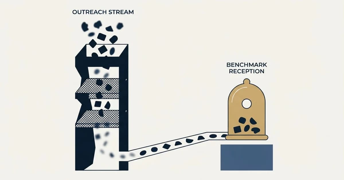
The industry figure that 60% to 80% of positive responses arrive after the opening message is a share, not a lift: it divides replies by position inside a programme that already sends five or six, and no published benchmark compares it against one good message to the same list. The companion lore, that 80% of sales need five or more contacts, counts contacts of every kind across a whole sales cycle and carries no source. RevenueFlow keeps every figure on the page and sends one message per campaign.
Key takeaways
- The 60% - 80% headline is a share of replies by position, not a measured lift over a single-message control, and no published benchmark supplies that control.
- The 80% / 44% / 94% lore carries no source and never defines a contact, so it describes sales cycles rather than unanswered cold emails.
- Per-position returns fall monotonically from 2% - 4% at the second message to 0.3% - 1% at the seventh and beyond.
- Send timing is a separate question and the figures apply to any message: Tuesday to Thursday, 8-10 AM in the recipient's timezone, with weekends at 50% - 55% of optimal.
- The two highest-rated openings in the market's own table are a new insight and an observed trigger, both of which are premises for a new campaign rather than a continuation of an old one.
Reviewed and updated October 1, 2026
Cold Email Follow-Up Benchmarks: 2026 Performance Data
The figures on this page are the ones the industry quotes. They are reproduced here unchanged, and then read against their own definitions, which is where most of them stop supporting the conclusion they are usually attached to.
Two things are true at once. Contacting a stranger repeatedly does produce replies that a single message would not have produced. And almost every number used to prove that point is measuring something narrower than the claim it is asked to carry. RevenueFlow sends one message per campaign, and this page is the arithmetic behind that decision rather than a slogan in front of it.
About This Data
The benchmarks presented in this report are compiled from publicly available industry research, aggregated data from sales engagement platforms, and typical ranges observed across B2B cold email campaigns. These figures represent industry estimates and general ranges rather than definitive standards. Your actual results will vary based on your specific industry, target audience, messaging quality, and outreach approach.
We recommend using these benchmarks as directional guidance while establishing your own baseline metrics through consistent tracking and testing.
The headline figure, and what it actually measures
The statistic that carries this entire category is that 60% to 80% of positive responses arrive after the opening message. That figure is real and we are not disputing it.
It is also a share, not a lift. It divides replies by the position that produced them, inside a programme that sends five or six messages to every prospect. A denominator built from five positions and one opening message will put most of its mass outside the opening message more or less by construction. The statistic answers "where in this programme did the replies land". It does not answer the question people use it for, which is "how many more replies did this programme get than one good message to the same list would have".
Nothing in the published benchmark set answers that second question, because a like-for-like comparison against a single-message control is not something the industry publishes.
The lore table
These four numbers travel together and appear in almost every article on this subject, including the earlier version of this one.
| Statistic | Industry finding |
|---|---|
| Percentage of sales requiring 5+ contacts | 80% |
| Salespeople who give up after one contact | 44% |
| Salespeople who give up after four contacts | 94% |
| Replies arriving after the opening message | 60% - 80% |
Read the first row closely. It counts contacts, and it never defines one. A contact in that figure is not distinguished from a demo, an inbound enquiry, a referral introduction, a conference conversation or a renewal call. Read literally, it is a claim about how many interactions a deal takes from first awareness to signature, which is uncontroversial and has almost nothing to do with how many unanswered emails to send a stranger.
The second and third rows are behavioural, not causal. They describe what salespeople do. They do not establish that the ones who kept going were right to.
None of the four rows carries a source in the material that circulates them, which is why this page now presents them as the industry lore they are rather than as evidence.
Those same four figures are what circulate as sales follow-up statistics, and the only honest way to use them is the one applied above, because a number whose original publisher cannot be named is a claim rather than a measurement.
What each additional message returns
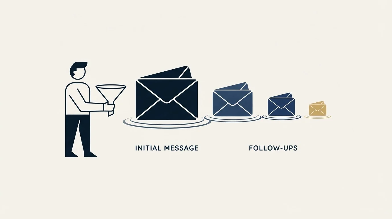
This is the table with the real information in it, and it is the one least often quoted.
| Position | Individual reply rate | Share of total replies |
|---|---|---|
| Message two | 2% - 4% | 20% - 28% |
| Message three | 1.5% - 3% | 12% - 18% |
| Message four | 1% - 2.5% | 8% - 14% |
| Message five | 0.8% - 2% | 5% - 10% |
| Message six | 0.5% - 1.5% | 3% - 7% |
| Message seven and beyond | 0.3% - 1% | 2% - 5% |
Both columns fall monotonically. By the sixth position the campaign is asking a thousand people again for somewhere between three and ten replies.
The conventional summary of that table is that the cumulative effect is substantial: five messages at 1-2% each add 4-8% of replies on top of whatever the opening message produced, taking the programme to a cumulative 8-15%. That arithmetic is correct. It is also the whole of the case, and it is stated without a cost column.
Where we differ from standard practice
- Adds 4% - 8% of replies across positions two to six
- Treats 0.3% - 1% at the tail as upside with no downside
- Needs a reply-detection safety net so answered prospects are not written to again
- Judges the programme on total replies
- One message per campaign, and the campaign is complete when it is sent
- Puts the saved effort into the list, the premise and the opening message
- Has no answered-prospect risk to detect, because nothing is scheduled behind the send
- Judges the programme on qualified meetings
Our position is not that the extra replies are imaginary. It is that they are bought with sending reputation, with the account's willingness to hear from us again, and with attention that would otherwise go into the message that produces the largest single share of replies in every table on this page.
The timing figures, as the market reports them
Reported gaps between one message and the next.
| Gap | Reported performance | Perception |
|---|---|---|
| Same day | Very poor | Aggressive, spammy |
| 1 day | Poor | Too pushy |
| 2 days | Below average | Slightly aggressive |
| 3-4 days | Good | Professional persistence |
| 5-7 days | Optimal for most | Respectful |
| 8-14 days | Good for later positions | Patient |
| 15+ days | Lower performance | May lose context |
| Position | Days after the previous message | Stated rationale |
|---|---|---|
| Message two | 3-4 business days | Quick while interest is fresh |
| Message three | 4-5 business days | Moderate persistence |
| Message four | 5-7 business days | Respectful spacing |
| Message five | 7-10 business days | Lighter touch |
| Message six | 10-14 business days | Final positions |
The right-hand column of the first table is the interesting one. It is not a performance column at all. It is a record of how the recipient is expected to feel, and it runs from "spammy" to "may lose context" without ever reaching "welcome". The whole grid is an exercise in locating the least annoying point on a curve that has no positive end.
When a message lands
Send timing is a genuinely separate question from how many messages to send, and these figures apply to any message, including a campaign that only ever sends one.
| Day | Reported reply rate | Relative performance |
|---|---|---|
| Monday | Medium | 90% of optimal |
| Tuesday | Highest | 100% (baseline) |
| Wednesday | High | 95% of optimal |
| Thursday | High | 95% of optimal |
| Friday | Medium-Low | 80% of optimal |
| Saturday | Low | 50% of optimal |
| Sunday | Low | 55% of optimal |
| Time window | Reported performance | Notes |
|---|---|---|
| 6-8 AM | Medium | Early risers check email |
| 8-10 AM | Highest | Start of business day |
| 10 AM-12 PM | High | Active work hours |
| 12-2 PM | Medium | Lunch time, lower attention |
| 2-4 PM | Medium-High | Afternoon productivity |
| 4-6 PM | Medium | End of day wrap-up |
| After 6 PM | Low | Personal time |
Tuesday through Thursday, landing between 8 and 10 AM in the recipient's own timezone, is the reported window. We use it. A programme that sends once has exactly one shot at that window, which is an argument for taking timezone handling seriously rather than an argument for more attempts.
Reported length by position
| Position | Reported word count |
|---|---|
| Message two | 50-80 words |
| Message three | 40-70 words |
| Message four | 50-90 words |
| Message five | 30-60 words |
| Message six and beyond | 25-50 words |
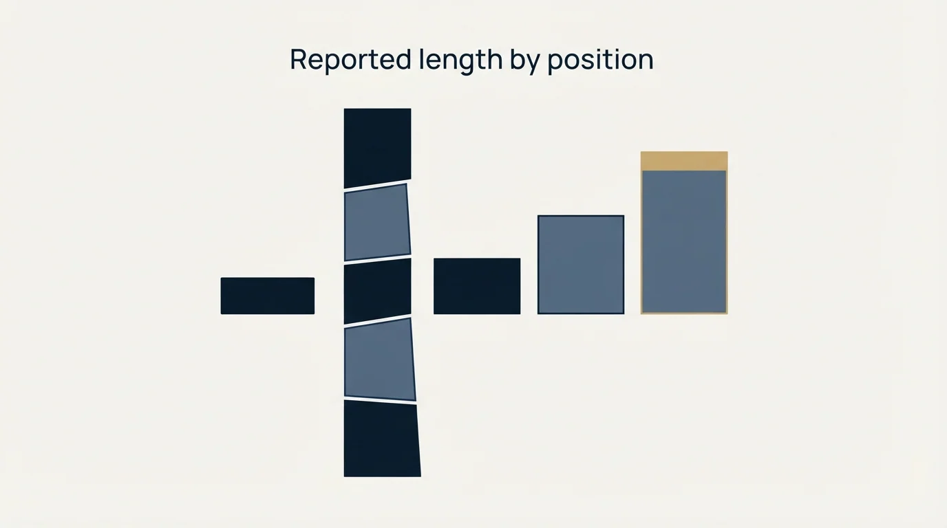
Every row is shorter than a normal opening message, and the guidance is explicit that this is because the case has already been made. A column of progressively shorter messages, each with progressively less to say, is a fair description of diminishing returns written as style advice.
What reportedly works, and where that points
| Approach | Reported reply impact |
|---|---|
| No new information | Below average |
| Reference to the previous message plus a new angle | Above average |
| A relevant resource | High |
| New social proof | High |
| A direct question | Above average |
| A permission-based close | High |
| Opening approach | Reported effectiveness |
|---|---|
| "Just following up on my email..." | Low |
| A short reference to the previous message on [topic] | Medium |
| "[New insight or data point]..." | High |
| "Noticed [relevant trigger]..." | Very High |
| "Thought you might find this useful..." | High |
| "Quick question..." | Medium-High |
Read those two tables together and they make our argument for us. The lowest-rated openings are the ones whose only content is that a previous message went unanswered. The highest-rated are a new insight and an observed trigger event, and both of those are premises for a new campaign to a fresh audience, not continuations of an old one. The market's own effectiveness ranking says the strongest material is the material that would have worked as an opening message.
The reported uplifts point the same way.
| Pattern | Reported performance versus average |
|---|---|
| Sharing content, research or a resource | 20-30% above average |
| Referencing recent news, funding or a company change | 30-50% above average |
| Sharing a case study from a similar company | 15-25% above average |
| Asking a specific, easy question | 10-20% above average |
| A closing message that creates finality | 25-40% above average (final position only) |
The strongest of those, at 30% to 50%, is a trigger event. A trigger event is a reason to write that did not exist before, which is precisely the test we apply before opening a new campaign against a list we have already contacted.
By industry
| Industry | Reported optimal count | Reported share arriving after the opening | Strongest reported position | Reported gap |
|---|---|---|---|---|
| Technology and SaaS | Four to five | 60% - 70% | Message two to three | 3-5 days |
| Professional services | Three to four | 55% - 65% | Message two | 4-6 days |
| Healthcare | Four to five | 65% - 75% | Message three to four | 5-7 days |
| Financial services | Four to five | 60% - 70% | Message three | 5-7 days |
Professional services reports the lowest count, the lowest share arriving late, and the earliest strongest position. It is the vertical where relevance is easiest to establish up front, and the numbers move exactly as you would expect them to when the opening message is good.
By seniority
| Target level | Reported optimal count | Reported response pattern |
|---|---|---|
| Individual contributor | Three to four | Earlier responses |
| Manager | Four to five | Middle of the programme |
| Director | Four to five | Middle to late |
| VP | Five to six | Late |
| C-Suite | Five to seven | Late, reportedly needs more attempts |
This is the table we disagree with most sharply, and the disagreement is not about the data. Senior executives receive the most unsolicited contact of any group in the corpus, and the conventional response to their lower reply rate is to contact them more. The same rows read the other way say that the group with the least tolerance for unsolicited email is the group the market has decided to send the most of it to.
When to stop
This table is unchanged, because it is correct and it is the most useful thing on the original page.
| Signal | Action |
|---|---|
| Explicit "not interested" | Stop immediately, add to suppression |
| Unsubscribe request | Stop immediately, honour the request |
| Spam complaint | Stop immediately, review targeting |
| Multiple bounces | Stop, remove from list |
| Company out of business | Stop, clean the data |
| Contact left the company | Stop, find a new contact |
Our answer to "when to stop" is one row shorter than everyone else's: after the message we sent. Every row above still applies, because suppression, bounce handling and list hygiene are not contingent on how many messages a campaign contains.
Where a third message belongs inside a thread the person already replied on, how to write a third follow up email covers the craft line by line.
| Metric | Warning sign | Recommended action |
|---|---|---|
| Open rates declining | Below 10% by the third message | Review subject lines |
| No engagement at all | No opens after five messages | Consider list quality |
| Rising unsubscribes | Above 0.5% per message | Reduce frequency |
| Negative replies increasing | More than positives | Review messaging |
Three of those four warning signs are list-quality problems, and the fourth is a messaging problem. None of them is solved by contacting the same person again, which is what makes this table a targeting checklist wearing a persistence label.
The automation table, read honestly
| Approach | Reported reply rate | Scalability |
|---|---|---|
| Fully manual | Highest | Very low |
| Automated with personalization | High | High |
| Fully automated, template only | Medium | Highest |
| Single message only | Lowest | N/A |
| Practice | Reported impact |
|---|---|
| Pause on reply | Essential, prevents embarrassing sends |
| Personalize the first line of each message | +30-50% reply rate |
| Vary send times slightly | +5-10% deliverability |
| Test variations against each other | Continuous improvement |
| Track per-message metrics | Enables optimization |
The first row of the second table deserves more attention than it gets. A scheduled programme needs a reply-detection safety net to avoid writing to someone who has already answered, and the guidance calls that safety net essential because when it fails the failure is visible to the customer. A campaign that sends once has no such failure mode available to it. That is not a small operational difference and no benchmark table anywhere prices it.
The second row is the one we act on. Personalizing the opening line is reported at +30% to +50%, the largest single-practice number on this page, and it applies in full to a campaign that sends one message.
Measuring a single-message campaign
| Metric | Formula | Target |
|---|---|---|
| Reply rate | Replies / messages sent | 1-3% |
| Positive reply rate | Positive replies / total replies | 50%+ |
| Campaign reply rate | Total replies / prospects contacted | 2% - 4% |
| Share arriving after the opening message | Not applicable | Zero by design, against a market target of 55-70% |
For attribution, the conventional models are these.
| Attribution model | Use case |
|---|---|
| Last touch | Simple, may undervalue the opening message |
| First touch | Values initial outreach, may undervalue what came after |
| Full programme | Most accurate where several messages were sent |
A campaign that sends one message makes this table trivial, which is worth noting as a benefit rather than an omission. Attribution ambiguity is a cost of the multi-message design, and it is a cost paid by every reporting conversation that design ever produces.
Setting realistic goals
The market's published targets for a full multi-message programme.
| Metric | Conservative | Ambitious |
|---|---|---|
| Share arriving after the opening message | 50% | 70% |
| Reply rate per message | 1% | 2.5% |
| Cumulative reply rate | 8% | 15% |
| Positive-to-negative ratio | 1:1 | 2:1 |
Hold any vendor to the bottom three rows. The cumulative reply-rate row is the honest test of a programme however it is built, and the positive-to-negative ratio is the row that quietly tells you whether the list was right. We aim at the same numbers with a single message and let the meeting count settle it.
What we do instead
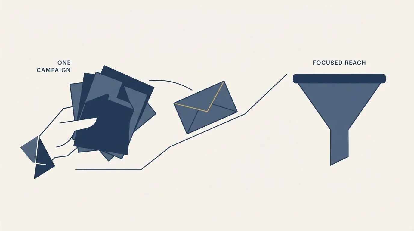
One message per campaign. No thread replies, no bumps, no second scheduled attempt at a stranger who did not answer the first.
The effort that a conventional programme spends on positions two through six goes earlier for us: into who is on the list, into whether the premise is specifically true of them, and into the deliverability infrastructure that determines whether the one message reaches an inbox at all.
The write-up of what happened to our own meeting rate is in why we send no follow-ups, and the deliverability numbers that make the tail expensive are in our cold email deliverability benchmarks.
Working with us
RevenueFlow runs done-for-you cold email for B2B teams: list building, deliverability infrastructure, copy, and reply handling. Every campaign sends one message per prospect.
If you would rather have this run for you, the engagement on offer starts with a strategy call, we build and operate the engine, and it is priced per qualified meeting. The case studies are the short version.
Related Reading
Frequently asked questions.
Frequently asked questions- How many follow-up emails should I send in a cold email campaign?
- Reported practice is four to six messages altogether, adding a cumulative 4-8% of replies on top of the opening message. RevenueFlow sends none. That is a judgement about price rather than about the data: each extra position returns less than the one before it, down to 0.3% - 1% by the seventh, and it is bought with sending reputation and with accounts you can no longer approach cleanly on a better premise later.
- Is it true that 80% of sales require five or more contacts?
- The figure circulates without a source and without a definition of a contact. Read literally it counts every interaction across a whole sales cycle, which includes demos, inbound enquiries, referral introductions and renewal calls. That is an uncontroversial claim about how deals form and it says nothing about how many unanswered emails to send a stranger. The companion figures, that 44% of salespeople stop after one contact and 94% after four, are behavioural: they describe what people do, not whether the ones who kept going were right.
- Do 60% to 80% of replies really come after the first email?
- Yes, and it is the wrong number for the decision it is used to justify. It is a share, computed inside a programme that sends five or six messages, so a denominator built that way puts most of its mass outside the opening message more or less by construction. The question people actually want answered is how many more replies that programme produced than one good message to the same list, and no published benchmark measures it, because nobody runs the single-message control.
- What day and time should a cold email land?
- Tuesday through Thursday, between 8 and 10 AM in the recipient's own timezone. Tuesday is the reported baseline at 100%, Wednesday and Thursday at 95%, Monday at 90% and Friday at 80%, with Saturday and Sunday at 50% - 55%. Send timing is genuinely separate from how many messages a campaign contains, and these figures apply in full to a campaign that only ever sends one, which is why we take timezone handling seriously.
- What does RevenueFlow do instead?
- One message per campaign, then reply handling by a person. The effort a conventional programme spends on later positions goes into the list, into whether the premise is specifically true of the people on it, and into the deliverability infrastructure that decides whether the message arrives. We are paid per qualified meeting, so the cost of getting that trade wrong lands on us.
About the author.

Hosun Chung is COO at RevenueFlow, which builds and operates outbound revenue engines for B2B companies. Previously at Gleacher Shacklock LLP. Studied at London School of Economics.
Hosun Chung · COO
Connect on LinkedIn →Explore more.
Ready to scale your outreach?
We build GTM engines that book real meetings. See the receipts.
Related articles.
Cold Email Sequence Benchmarks: 2026 Performance Data
Every industry sequence figure, kept intact and read honestly: the opening message produces 30-40% of replies, and here is what the rest of them cost.
Cold Email Spam Rate Benchmarks: 2026 Performance Data
Industry standards require keeping spam complaint rates below 0.1% to maintain sender reputation. Learn the benchmarks and strategies to protect your cold email deliverability.
Cold Email Bounce Rate Benchmarks: 2026 Performance Data
A 3.04% platform bounce rate held 1.27% true hard bounces, 2.38% with blocks included, and 12.6% delay notices. What low bounce email data is made of.
Cold Email Subject Line Benchmarks: 2026 Performance Data
Industry data reveals that subject lines determine 35-50% of open rate variation. Discover the benchmarks for length, personalization, and format that drive the highest engagement.
Cold Email Personalization Benchmarks: 2026 Performance Data
LeadMagic, Cognism, Explorium and others sell funding and competitor signals. What published data ties to higher reply rates, and how to turn a signal into a line.
Cold Email A/B Testing Benchmarks: 2026 Performance Data
Industry data shows systematic A/B testing improves cold email performance by 15-30% over time. Discover the benchmarks for test design, sample sizes, and expected lift.