Cold Email Sequence Benchmarks: 2026 Performance Data
Every industry sequence figure, kept intact and read honestly: the opening message produces 30-40% of replies, and here is what the rest of them cost.
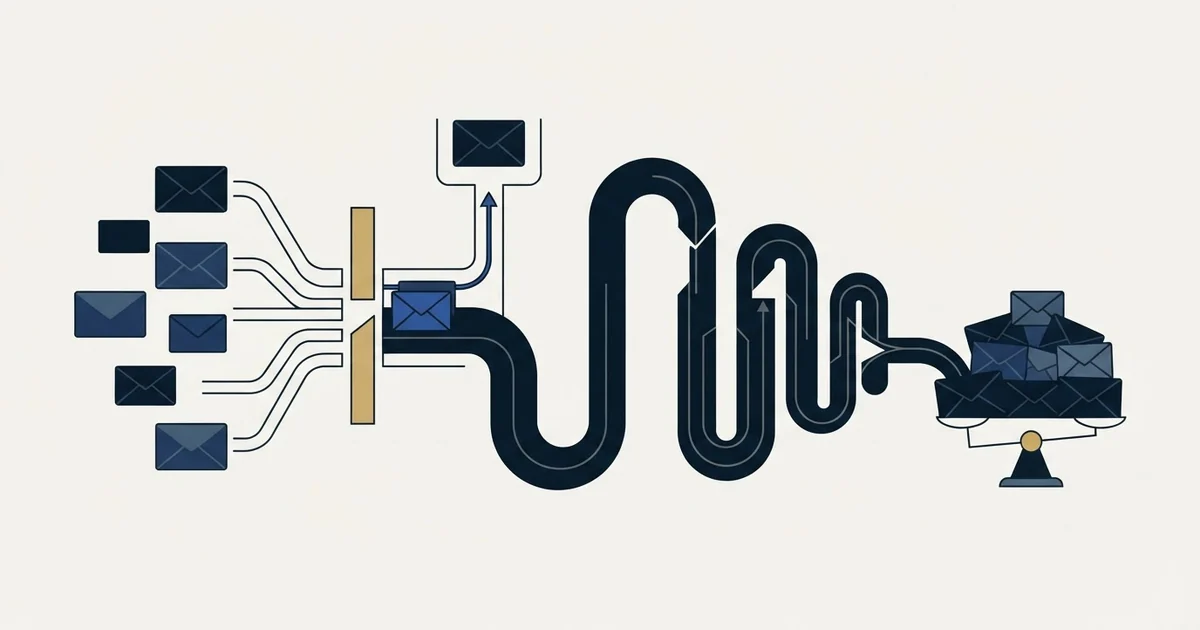
Industry benchmark tables give the opening message 30-40% of all replies, and every position after it adds between 0.2% and 1%. RevenueFlow keeps all of those figures and draws the opposite conclusion: the extra replies are real, but they are paid for in sending reputation, in list burn and in brand, none of which the tables price. So we send one message per campaign and put the saved effort into the list and the opening message.
Key takeaways
- The opening message produces 30-40% of all replies, the largest single share in every published table on the subject.
- Incremental returns fall monotonically by position, from 2.5% - 4.5% at the opening to 0.2% - 0.5% at the seventh and beyond.
- The cumulative figures are real: the market reports 2% - 4% from a single message rising to 10% - 16% across six of them.
- What no benchmark prices is the cost side: sending reputation, list burn, brand, and operator attention diverted from the message that produces the largest share.
- RevenueFlow sends one message per campaign and is paid per qualified meeting, so the cost of the tail lands on us rather than on the client.
Reviewed and updated October 1, 2026
Cold Email Sequence Benchmarks: 2026 Performance Data
Every number in this report is the same number it has always been. The reading has changed.
Read together, the market's own benchmark tables say something the industry rarely says out loud: the first message does most of the work, each message after it buys a fraction of a percent, and none of the tables price what that fraction costs. This report keeps the figures intact, puts the cost side next to them, and explains what RevenueFlow does with the same data.
About This Data
The benchmarks presented in this report are compiled from publicly available industry research, aggregated data from sales engagement platforms, and typical ranges observed across B2B cold email campaigns. These figures represent industry estimates and general ranges rather than definitive standards. Your actual results will vary based on your specific industry, target audience, messaging quality, and sending infrastructure.
We recommend using these benchmarks as directional guidance while establishing your own baseline metrics through consistent tracking and testing.
Where the replies actually come from
This is the table that matters, and it is the one most often quoted to argue the opposite of what it says.
| Position | Share of total replies | Cumulative share |
|---|---|---|
| Message one | 30% - 40% | 30% - 40% |
| Message two | 20% - 28% | 50% - 68% |
| Message three | 12% - 18% | 62% - 86% |
| Message four | 8% - 12% | 70% - 98% |
| Message five | 5% - 8% | 75% - 100% |
| Message six and beyond | 3% - 6% | 78% - 100% |
The opening message alone accounts for three to four replies out of every ten. Nothing else on the list comes close, and the share falls monotonically from there.
What each additional message buys
Share of replies is a flattering way to present the same data, because it hides the denominator. Here is the same performance expressed as what each position adds to the campaign's own reply rate.
| Position | Incremental reply rate |
|---|---|
| Message one | 2.5% - 4.5% |
| Message two | 1.5% - 3% |
| Message three | 1% - 2% |
| Message four | 0.7% - 1.5% |
| Message five | 0.5% - 1% |
| Message six | 0.3% - 0.8% |
| Message seven and beyond | 0.2% - 0.5% |
By the sixth position a thousand prospects are being asked again for somewhere between three and eight replies. Those replies are real. They are also the entire argument, and the tables stop exactly where the interesting question starts.
The cumulative view, as the market reports it
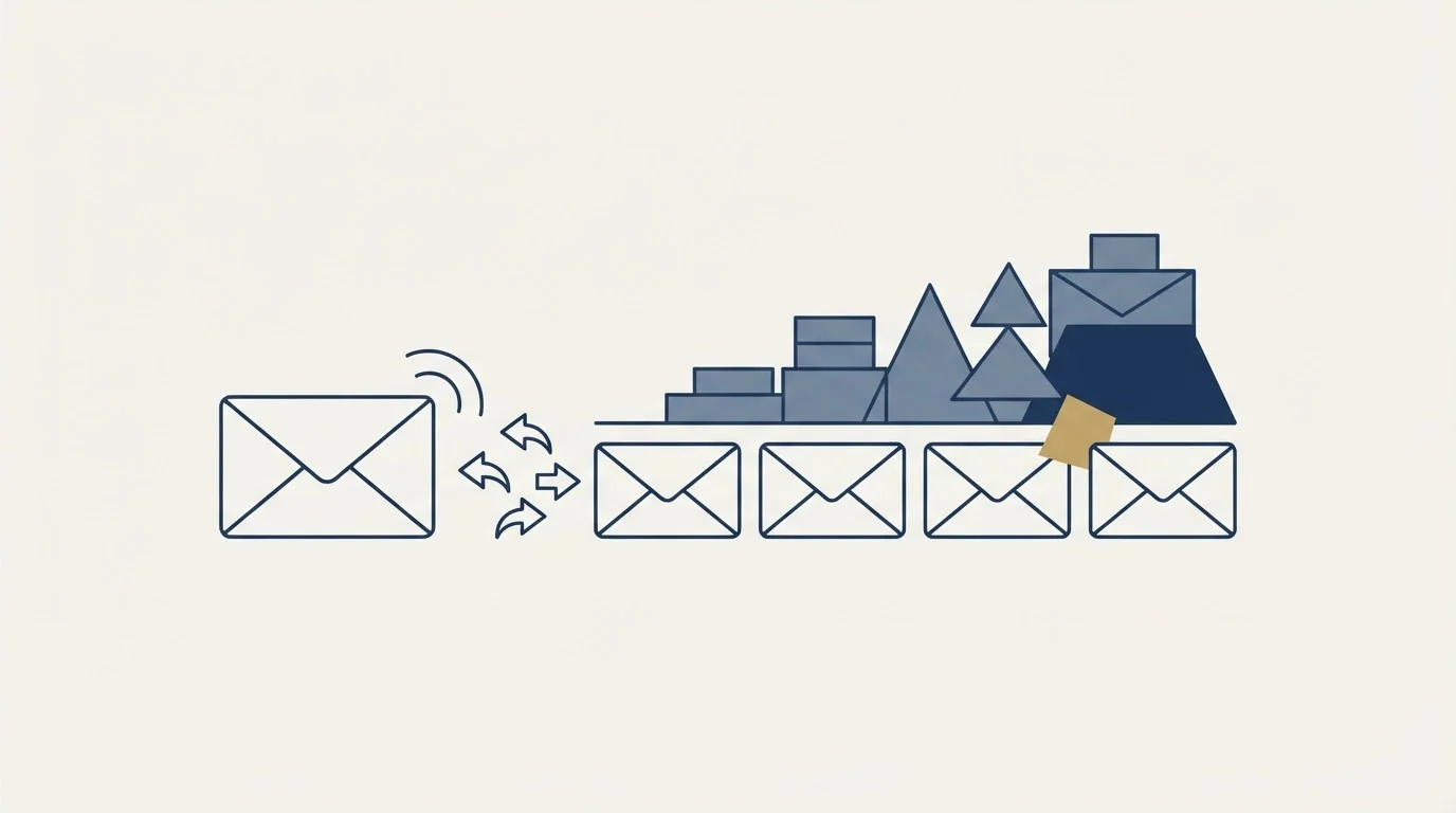
Market practice reads the same numbers cumulatively, and the cumulative view is genuinely higher.
| Messages per prospect | Cumulative reply rate |
|---|---|
| One message | 2% - 4% |
| Two messages | 4% - 7% |
| Three messages | 6% - 10% |
| Four messages | 8% - 13% |
| Five messages | 9% - 15% |
| Six messages | 10% - 16% |
| Seven or more | 10% - 17% |
Reported side by side against single-message performance, the same estimates appear as a lift.
| Approach | Typical reply rate |
|---|---|
| One message only | 2% - 4% |
| Three messages | 5% - 9% |
| Five messages | 8% - 14% |
| Seven or more | 10% - 16% |
Both tables are honest about their own arithmetic and silent about everything else. They count gross replies per prospect entered. They do not count what the extra contact costs, and the cost is not zero.
Two readings of the same table
Most outbound programmes treat the cumulative column as the target and design backwards from it. We read the same rows and stop at the first one.
- Targets the cumulative row: 10% - 16% reply rate per prospect entered
- Accepts 0.2% to 1% per position at the tail as free upside
- Treats non-response as the trigger for the next scheduled message
- Measures the programme by gross replies
- One message per campaign, and the campaign ends there
- Spends the saved effort on list quality and on the one message
- Treats silence as an answer, and changes the premise before writing again
- Measures the programme by qualified meetings, not gross replies
Same data, different conclusion. Ours is not that the incremental replies are imaginary. It is that they are bought, and the invoice arrives somewhere the benchmark tables do not look.
What the tail actually costs
Four costs sit outside every table on this page.
Deliverability. Repeated unanswered contact to the same mailbox is one of the strongest negative engagement signals a sending domain can generate, and the numbers that move are the ones in our cold email deliverability benchmarks. On shared sending infrastructure that damage is not contained to one campaign, and reputation is far slower to rebuild than it is to spend.
List burn. A prospect contacted repeatedly without answering is a prospect you cannot approach cleanly in six months. The tail converts a re-approachable account into a burned one, and the benchmark tables count the reply while ignoring the account.
Brand. The tail positions are, by the market's own content guidance, progressively shorter and progressively more insistent. The final position is conventionally a permission-to-close question. That is a real message from a real person at your company to a stranger who has already declined to answer, and it is read as such.
Attention. Operator time spent on positions four through seven is time not spent on the list, the offer, or the one message that produced 30% to 40% of the replies. That trade is invisible in a reply-rate table and decisive in a pipeline.
None of those four costs has a published benchmark. That is precisely why the tail looks free.
Spacing, as the market reports it
Market practice widens the gap as contact continues. These are the reported ranges.
| Gap | Recommended | Acceptable range |
|---|---|---|
| Between the first and the second message | 3-4 business days | 2-5 days |
| Between the second and the third | 4-5 business days | 3-7 days |
| Between the third and the fourth | 5-7 business days | 4-10 days |
| Between the fourth and the fifth | 7-10 business days | 5-14 days |
| Between the fifth and the sixth | 10-14 business days | 7-21 days |
| Spacing pattern | Reply impact | Complaint impact |
|---|---|---|
| Daily | Lower replies, fatigue | Higher complaints |
| Every 2 days | Moderate performance | Elevated complaints |
| 3-5 days early, widening | Highest replies | Normal complaints |
| 7 days or more early | Lower replies, lost momentum | Lower complaints |
| 14 days or more | Much lower replies | Lowest complaints |
Read the second table honestly and it is a complaint-rate curve wearing a reply-rate label. The pattern that maximises replies is not the pattern that minimises complaints, and the gap between those two optima is the cost this report has been describing.
Reported length by position
| Position | Reported word count |
|---|---|
| Message one | 75-125 words |
| Message two | 50-100 words |
| Message three | 75-125 words |
| Message four | 50-100 words |
| Message five | 40-75 words |
| Message six | 30-60 words |
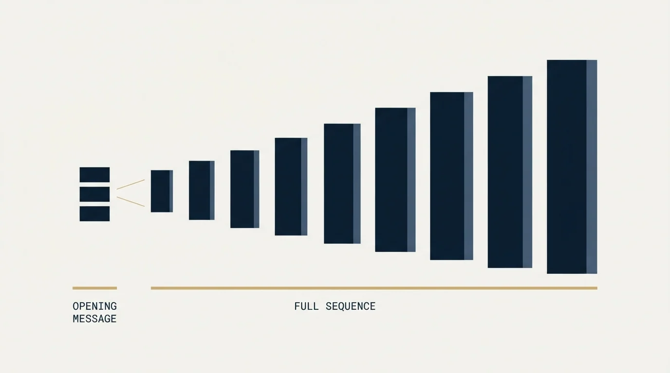
The shape of that column is the argument in miniature: the messages get shorter because there is progressively less to say and progressively less licence to say it. We put the whole word budget into the first touch and stop.
By industry
Reported market figures, unchanged.
| Industry | Reported optimal length | Reported reply rate | Strongest reported position | Reported programme duration |
|---|---|---|---|---|
| Technology and SaaS | Five to six messages | 8% - 14% | Message two to three | 21-35 days |
| Professional services | Four to five messages | 10% - 18% | Message one to two | 18-28 days |
| Healthcare and life sciences | Four to five messages | 6% - 12% | Message three to four | 21-35 days |
| Financial services | Four to six messages | 6% - 11% | Message two to three | 21-42 days |
Professional services is the interesting row: the highest reported reply rate in the table belongs to the vertical whose strongest reported position is the first one, on the shortest reported programme duration. Where relevance is highest, the tail matters least.
By company size
| Company size | Reported optimal length | Reported reply rate | Reported gap |
|---|---|---|---|
| Startup (1-10) | Four to five messages | 12% - 20% | 2-4 days |
| Small (11-50) | Four to five messages | 10% - 17% | 3-5 days |
| Mid-market (51-200) | Five to six messages | 8% - 14% | 3-5 days |
| Enterprise (201-1000) | Five to seven messages | 6% - 11% | 4-7 days |
| Large enterprise (1000+) | Six to eight messages | 4% - 8% | 5-10 days |
The two columns move in opposite directions. Reported reply rates fall from 12% - 20% to 4% - 8% as company size rises, while reported contact volume climbs. That is a targeting finding presented as a persistence finding, and it is the clearest example on this page of a number being asked to argue for something it does not say.
Multiple channels
| Approach | Typical reply rate |
|---|---|
| Email only | 8% - 14% |
| Email plus LinkedIn | 12% - 20% |
| Email, LinkedIn and phone | 15% - 25% |
| Combination | Reported lift over email only |
|---|---|
| Email plus LinkedIn profile views | +15% - 25% |
| Email plus LinkedIn messages | +25% - 40% |
| Email, LinkedIn and phone | +40% - 60% |
Adding channels adds reach, and the reported lifts are substantial. The mechanism on LinkedIn is different from email, though, and it matters here.
A second LinkedIn message to someone who ignored the first lands in the same conversation directly beneath it, which reads as a bump regardless of how the campaign is structured.
So a prospect gets one LinkedIn message from us, on its own premise, and the two channels are treated as two audiences rather than two positions in one programme. The reasoning is set out in our LinkedIn account-based marketing write-up.
Closing messages
The last position in a conventional programme has its own reported numbers.
| Closing approach | Reported reply rate | Reply quality |
|---|---|---|
| Circling back one last time | 1.5% - 3% | Mixed |
| Sharing a resource with no ask | 1% - 2.5% | Higher quality |
| Asking permission to close the file | 2% - 4% | Frequently a yes to closing |
| Leaving the door open for later | 0.8% - 1.5% | Plants a seed |
| Gap from the previous message | Reported performance |
|---|---|
| 3-5 days | May feel rushed |
| 7-10 days | Best reported performance |
| 14-21 days | Good for busy executives |
| 30 days or more | Loses context |
The 2% - 4% row is the one usually cited as proof that the tail works. Read the quality column beside it. The strongest reported response to a permission-to-close question is agreement that the file should be closed, which is a reply, not a pipeline.
Approaching a list again later
When a stranger who never answered is approached again months later, market practice reports the following.
| Time since the last contact | Reported reply rate |
|---|---|
| 30 days | 1% - 2% |
| 60 days | 1.5% - 3% |
| 90 days | 2% - 4% |
| 180 days | 1% - 2.5% |
| Position | Reported reply rate |
|---|---|
| First message after the gap | 1.5% - 3% |
| Second | 0.8% - 1.5% |
| Third | 0.5% - 1% |
The first row of the second table is the only one we act on, and only once no fresh prospects remain for that audience: the same email, unchanged, goes out as a new single-message campaign, which makes it a first message in its own campaign rather than a continuation of anything. We do not send the two rows beneath it.
What we do instead
One message per campaign. No thread replies, no bumps, no scheduled second attempt at a stranger who did not answer.
The effort that market practice spends on positions two through seven, we spend earlier: on who is on the list, on whether the premise is true of them specifically, and on the deliverability infrastructure that decides whether the one message arrives at all. When a campaign is finished, it is finished. Where no fresh prospects remain for an audience, the same email goes out again as a new campaign, and the only edit is a fact that has stopped being true since the first send.
We are not claiming the incremental replies in the tables above do not exist. We are claiming they are the most expensive replies in outbound, and that a campaign designed to earn the 30% - 40% row properly beats one designed to grind out the 3% - 6% row. What happened to our own meeting rate is written up in why we send no follow-ups.
Measuring a single-message campaign
| Metric | Formula | Target |
|---|---|---|
| Campaign reply rate | Replies / prospects contacted | 2% - 4% |
| Positive reply rate | Positive replies / prospects contacted | Track separately |
| Meeting conversion | Meetings held / prospects contacted | 1.5% - 4% |
| Unsubscribe rate | Unsubscribes / prospects contacted | Below 2% |
Two of those four figures are unchanged from the conventional targets on this page, because they are properties of the audience and the offer rather than of contact volume. The reply-rate target is the honest one: a single-message campaign should be measured against the single-message row, and then judged on what those replies turn into.
Setting realistic goals
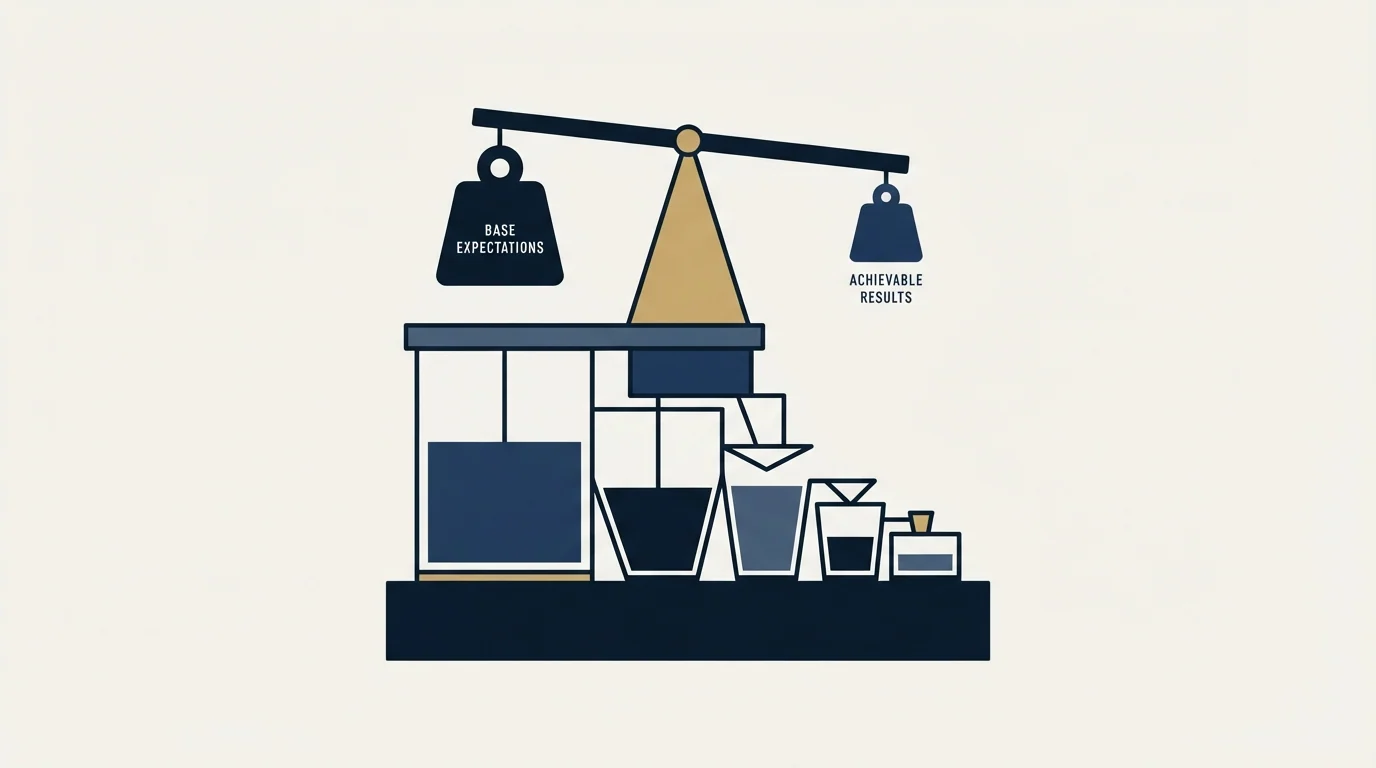
| Metric | Conservative | Ambitious |
|---|---|---|
| Reply rate | 8% | 15% |
| Positive reply rate | 3% | 7% |
| Meeting conversion | 1.5% | 4% |
| Unsubscribe rate | Below 2% | Below 1% |
Those are the market's published targets for a full multi-message programme, and they are the right targets to hold a vendor to. Ours is a harder version of the same test: reach them on the strength of the audience and the first message, and let the meeting count settle the argument.
Working with us
RevenueFlow runs done-for-you cold email for B2B teams: list building, deliverability infrastructure, copy, and reply handling. Every campaign we run sends one message per prospect.
If you would rather have this run for you, the engagement on offer starts with a strategy call, we build and operate the engine, and it is priced per qualified meeting. If you would rather see the outcome first, the case studies are the shortest version of the argument.
Related Reading
Frequently asked questions.
Frequently asked questions- How many emails should be in a cold outreach sequence?
- The market reports four to six as its own optimum, on cumulative reply rates of 8% - 16% against 2% - 4% for a single message. RevenueFlow sends one. The published figures are not in dispute; what is missing from them is the price of the extra positions, which is paid in sending reputation, in accounts you can no longer approach cleanly, and in attention taken away from the message that produces 30% - 40% of the replies on its own.
- What share of replies comes from the opening message?
- 30% to 40%, which is the largest single share of any position. The remaining 60% to 70% is spread across five or six later positions, each returning less than the one before it: 1.5% - 3% at the second, falling to 0.2% - 0.5% by the seventh. Presented as a share it looks like the opening message is a minority contributor. Presented per position it is by some distance the most productive thing in the campaign.
- How many days should I wait between cold emails?
- Reported practice is 3-4 business days to the second message, widening to 10-14 by the fifth and sixth. Read the perception column beside those gaps and it runs from spammy at the short end to loss of context at the long end without ever reaching welcome, which is a fair summary of the whole exercise. RevenueFlow sends once, so the question does not arise; the timing that does matter is landing Tuesday to Thursday, 8-10 AM in the recipient's own timezone.
- Are single-message campaigns worse than multi-message ones?
- On gross replies per prospect entered, yes, and the published gap is 2% - 4% against 8% - 14%. That comparison is not like for like. It measures a well-resourced multi-message programme against whatever single message the same team happened to send first, and it counts no cost at all for the extra contact. We run single-message campaigns and are paid per qualified meeting rather than per reply, which is the version of this test with our own money on it.
About the author.

Hosun Chung is COO at RevenueFlow, which builds and operates outbound revenue engines for B2B companies. Previously at Gleacher Shacklock LLP. Studied at London School of Economics.
Hosun Chung · COO
Connect on LinkedIn →Explore more.
Ready to scale your outreach?
We build GTM engines that book real meetings. See the receipts.
Related articles.
Cold Email Follow-Up Benchmarks: 2026 Performance Data
The follow-up benchmarks kept intact and read against their own definitions, plus why RevenueFlow sends one message per campaign instead.
Cold Email Spam Rate Benchmarks: 2026 Performance Data
Industry standards require keeping spam complaint rates below 0.1% to maintain sender reputation. Learn the benchmarks and strategies to protect your cold email deliverability.
Cold Email Bounce Rate Benchmarks: 2026 Performance Data
A 3.04% platform bounce rate held 1.27% true hard bounces, 2.38% with blocks included, and 12.6% delay notices. What low bounce email data is made of.
Cold Email Subject Line Benchmarks: 2026 Performance Data
Industry data reveals that subject lines determine 35-50% of open rate variation. Discover the benchmarks for length, personalization, and format that drive the highest engagement.
Cold Email Personalization Benchmarks: 2026 Performance Data
LeadMagic, Cognism, Explorium and others sell funding and competitor signals. What published data ties to higher reply rates, and how to turn a signal into a line.
Cold Email A/B Testing Benchmarks: 2026 Performance Data
Industry data shows systematic A/B testing improves cold email performance by 15-30% over time. Discover the benchmarks for test design, sample sizes, and expected lift.