Hotjar Heatmaps: Five Types and One Sampling Rule
Heatmaps are built from recorded sessions, not every visit, and Hotjar's own docs say a thin sample produces a picture that looks like a finding and is not.
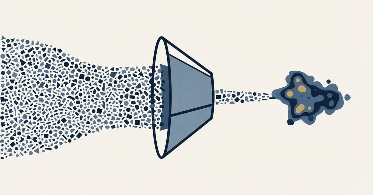
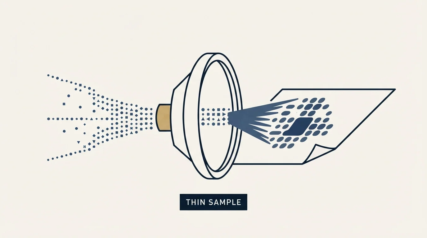
Hotjar offers five heatmap types: Click and Tap, Move, Scroll, Engagement Zones and Rage-clicks. All are built from recorded sessions rather than every visit. Move maps sample the cursor every 100 milliseconds, scroll maps compute an average fold line, and the product now sits inside Contentsquare.
Key takeaways
- Hotjar heatmaps are assembled from users whose session was recorded, so the population under the picture is a subset rather than all traffic.
- Hotjar's documentation states a move heatmap with few pageviews looks like a click heatmap until enough data accumulates.
- The scroll heatmap computes an average fold as total window height divided by page visit count, rendered as a labelled line.
- A heatmap only shows interactions on elements visible in the screenshot, so clicks inside collapsed menus are missing from the count.
Reviewed and updated September 2, 2026
Hotjar Heatmaps: Five Types, One Sampling Rule, and the Traffic They Need
Open hotjar.com/product/heatmaps today and the page title reads "Contentsquare Heatmaps: Visualize How Your Content Performs". The body says Contentsquare throughout, the navigation is the Contentsquare platform, and the pricing link lands on a Contentsquare page. The product people search for by its old name now sits inside a larger experience analytics suite, and the surrounding vocabulary has changed with it: conversion and revenue attribution, merchandising, checkout friction.
That reframing is the first thing a B2B team should notice, because it says who the product is currently sold to. The second is a line in the help centre about how the data is collected, and it decides whether a heatmap can tell you anything on a page with modest traffic.
The five types, and what each one is actually built from
Hotjar's documentation lists five heatmap types, and they are not five views of one dataset. Each is assembled differently.
Click and Tap shows where users clicked, with taps tracked on mobile and tablet. The colour scale runs red for the most frequently clicked areas and blue for the least. Clicks are recorded relative to elements rather than to the page, so a button's click position is stored against that button.
Move shows where users moved the cursor. The documentation puts the sampling rate at "every 100ms, or 10 times per second", with the data sent back at intervals.
Scroll shows how far down the page people got, calculated by comparing the number of users who visited against the depth each reached. Hovering over the map gives the exact percentage of users who reached that point.
Engagement Zones combines click, move and scroll data into one view, showing moderate, high and very high engagement relative to that page, with scroll data used to weight interactions further down the page.
Rage-clicks highlights the parts of a page producing repeated frustrated clicking.
The last two carry plan gating in the documentation, and several of the drill-down actions on the click and rage-click maps are annotated as requiring a specific Observe tier. Treat the feature list on a marketing page as the union of every plan rather than as what a given subscription buys.
- Which elements get clicked, and which non-interactive ones get clicked by mistake
- Where the cursor travels
- Click position stored relative to the element
- Cursor sampled every 100ms
- Percentage of users reaching any given depth
- Average fold marked on the page
- Scroll-depth ruler at 25, 50 and 75 percent
- Inaccurate across pages of differing length
- Combined click, move and scroll weighting
- Three relative engagement bands
- Repeated frustrated clicking on one element
- Plan-gated features
The sampling rule that decides whether any of this works
The documentation says clicks and taps are tracked for "all users whose session was recorded", and uses the same phrase for the mouse movement behind a move map. A heatmap is therefore built from recorded sessions rather than from every visit, which means the population underneath the picture is a subset governed by your recording settings and plan.
The documentation is unusually direct about what that means at low volume. On move maps it says the heatmap may initially look like a click heatmap when it has only a few pageviews, and that patterns emerge once you collect enough data. That is the vendor telling you, in its own help centre, that a thin sample produces a picture which looks like a finding and is not one.
This is the single most important sentence in the product for a B2B reader, because a campaign landing page fed by outbound frequently receives a few hundred visits a month. A heatmap over that population renders confidently, and the same thin base defeats any benchmark you might compare it against, which average landing page conversion rate works through. It is legible, it is colourful, and the differences it shows between two areas of the page are within the range that chance produces. The general form of that trap, and the habit of reporting counts alongside percentages so a thin base is visible, is set out in conversion rate.
Two collection details that change how a map should be read
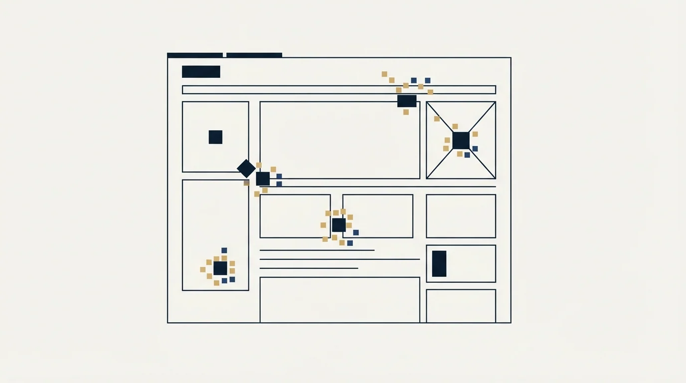
The screenshot bounds the data. The help centre warns under the heading "Hotjar may collect more click data than shows on your Heatmap" that only interactions on elements visible in the screenshot are displayed. Its own example is a dropdown menu: clicks on menu items that are not expanded in the screenshot do not appear, and the click count and percentage shown are based on visible elements only. A page whose navigation, accordions or tabs hide real interaction will under-report exactly the elements a designer most wants to judge. The raw data export is the route around it.
Multi-page maps break on scroll. The documentation states that a heatmap targeting multiple pages will not produce accurate scroll data if those pages vary in size, because the result is an average of how many users reached each portion. A set of campaign landing pages of different lengths is precisely that case.
The average fold is a computed number, and it is the useful one
Buried in the scroll heatmap documentation is a genuinely useful instrument. Hotjar calculates the average fold as total window height divided by page visit count, and renders it as a white line labelled AVERAGE FOLD. The scroll-depth ruler then shows that line alongside the share of users who scrolled 25, 50 and 75 percent down the page.
That converts a design argument into a measurement. Debates about what belongs above the fold usually run on assertion, and the fold itself is not a fixed line because device, browser and window size all move it. A number computed from your own visitors settles where your fold actually falls, and the ruler lets you compare how many people clicked an element against how many ever saw it, without switching between map types.
For a B2B page, that comparison is often more valuable than the click map on its own. An element with a low click count that almost nobody scrolled to is a placement problem. The same low count on an element everybody saw is a copy or offer problem, and the two need opposite fixes.
- Yes: You know how many recorded sessions the map was built from
- Yes: The elements you are judging are visible in the screenshot
- Yes: The map covers one page rather than several of different lengths
- Yes: You read the scroll ruler beside the click map before blaming the copy
- No: You are comparing two areas whose difference is a handful of clicks
- No: The page has had a few hundred visits and the pattern looks clear
What the product is currently optimised for
The Contentsquare-era heatmaps page leads on zone-based maps that attach conversion rate and revenue attribution to individual page elements, side-by-side comparison of A/B test variants, and form analysis showing which fields get abandoned. The use cases named are checkout friction, merchandising, and behaviour across repeat visits before a purchase.
Every one of those is strongest where there is a transaction, a large visitor population, and repeat visits inside a short window. Ecommerce, in other words. None of it is a criticism of the product. It is a description of the buyer it is built around, and it should govern how much of the feature list a B2B team expects to use.
The features that transfer cleanly to a B2B landing page are the plain ones: scroll depth against the average fold, click maps on a page with enough traffic to support them, and form analysis if your form is long enough to abandon. The revenue attribution layer has nothing to attach to when the conversion is a form fill whose value is decided months later by a sales process.
Where the constraint usually sits
There is a version of this article that ends with a list of heatmap best practices. The more useful ending is about sequence.
A heatmap is a diagnostic for a page that already receives traffic and converts worse than it should. It is not a diagnostic for a page that receives little traffic, because the tool cannot separate signal from noise at that volume and will hand you a confident picture regardless. Landing page lead generation makes the wider version of the point: a landing page converts demand that already exists and creates none, so when the flow of visitors is thin the page is not the binding constraint and improving it will not change the total.
The other common misdiagnosis is treating a campaign page problem as a site problem, or the reverse. A dedicated campaign page and a website page fail differently, and the leak points on a site that already has traffic are covered in lead generation website. Where the question is which layer of tooling can reach a given bottleneck at all, sales process optimization tools maps the layers.
- Position read every 100ms
- Ten readings a second
- Sampled per recorded session
- Looks like a click map at low volume
- Click and Tap
- Move
- Scroll
- Engagement Zones and Rage-clicks
- Average fold line
- 75 percent reached
- 50 percent reached
- 25 percent reached
The short version
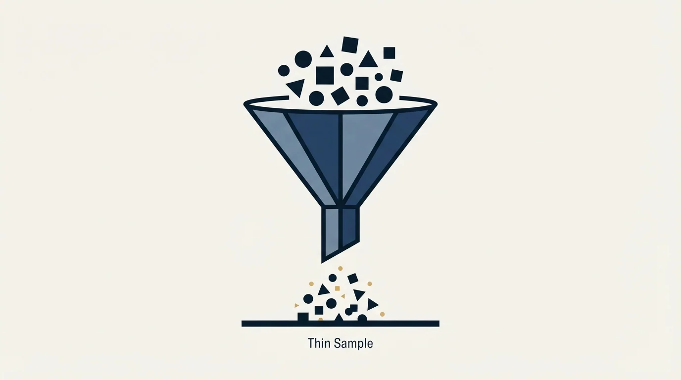
Hotjar heatmaps are Contentsquare heatmaps now, under a product page titled "Contentsquare Heatmaps", and the positioning has moved toward ecommerce conversion and "revenue attribution". Five map types answer different questions from differently assembled data, and all of them are built from recorded sessions rather than from every visit. The documentation says plainly that "the Heatmap may initially look like a click Heatmap when it has only a few pageviews", which is the vendor describing the failure mode of a thin sample.
Read the scroll ruler and the computed average fold before reading anything into a click map, check that the elements you care about are visible in the screenshot, and never run one map across pages of different lengths. Then ask whether the page or the traffic reaching it is the actual constraint. When it is the traffic, see what a first campaign produces against your own market.
Product positioning and heatmap mechanics here were read from hotjar.com and help.hotjar.com in August 2026. The pricing page renders client side and returned no plan figures to a plain fetch, so no prices appear above. Verify current terms with the vendor before relying on them.
Sources: Hotjar heatmaps product page, Hotjar documentation, Types of Heatmaps
Frequently asked questions.
Frequently asked questions- What are the different types of Hotjar heatmaps?
- Five: Click and Tap shows where people clicked or tapped, Move shows cursor travel, Scroll shows how far down the page people reached, Engagement Zones combines all three into relative engagement bands, and Rage-clicks highlights repeated frustrated clicking. Engagement Zones and several rage-click drill-downs carry plan gating in Hotjar's documentation.
- How much traffic does a heatmap need to be useful?
- More than most B2B campaign pages receive. Hotjar's own documentation warns that a move heatmap with only a few pageviews looks like a click heatmap, and that patterns emerge once enough data is collected. On a page taking a few hundred visits a month, the differences a map shows between two areas sit inside the range chance produces.
- Is Hotjar still Hotjar, or is it Contentsquare now?
- The heatmaps product page on hotjar.com is titled as a Contentsquare page and its body refers to Contentsquare throughout, with pricing served from a Contentsquare page. The old name still resolves and the documentation still says Hotjar. The practical change is positioning: the feature set now leads on revenue attribution and checkout friction.
- Why does a heatmap miss clicks that definitely happened?
- Hotjar only displays interactions on elements visible in the screenshot it captured, and it says so explicitly. Its own example is a dropdown menu, where clicks on items not expanded in the screenshot do not appear and are excluded from the click count and percentage. The raw data export contains the full interaction list.
About the author.

B2B cold email experts helping companies generate qualified leads through done-for-you outreach campaigns.
RevenueFlow Team
Explore more.
Ready to scale your outreach?
We build GTM engines that book real meetings. See the receipts.
Related articles.
Sales Prospecting for Consulting Firms: Find the Event
Prospecting for a consulting firm: where triggers are published by practice, who inside the firm reads them, why alumni and referrals come first, when to skip it.
LinkedIn Outreach for Utilities: Selling to the Sector
How a vendor selling to utilities uses LinkedIn next to a published sourcing process: the three ownership models, the registration gate and what a message may ask.
Cold Calling for Telecom Companies: A Carrier's Own Rules
What only a telecom company meets on the phone: the FTC exemption that stops at its contractor, the verified carrier change, and the CPNI limit on lists.
B2B Lead Lists for Associations: The Census Is Public
The anatomy of an association list: the IRS master file that enumerates every business league, the Form 990 lines that name officers and dues, and what vendors sell.
SDR Outsourcing for Business Brokers: The Fee Timing
Whether a success-fee brokerage should rent sales development at all: the fee timing, the texts that limit what an outside person may say about value, and who signs.
Appointment Setting for Business Brokers: The Seller Meeting
What a bought meeting with a business owner has to be for a brokerage: the three-part qualification, the confidentiality rules, the licence line and the owner's reasons.