Lead Generation Website: Where B2B Sites Leak Visitors
Most B2B sites have a conversion problem sitting on top of traffic they already paid for. The leak points in order, the offer ladder, and the step nobody owns.

A lead generation website is built so a qualified visitor can identify themselves and start a conversation, and every page is judged on whether it helps that happen. Most B2B sites lose visitors at understanding, at self-recognition, and at having only one available action aimed at buyers ready today.
Key takeaways
- Traffic is rarely the constraint: most B2B sites lose the visitors they already have at comprehension and at having only one available action.
- Google's guidance is that sites should aim for a Largest Contentful Paint of 2.5 seconds or less at the 75th percentile of page loads.
- A single generic contact form converts only visitors ready to talk today, which is the smallest of the three groups arriving.
- Time from submission to first human response is usually the cheapest improvement available and the step with no named owner.
Reviewed and updated September 2, 2026
Lead Generation Website: Where B2B Sites Leak the Visitors They Already Have
A B2B company rebuilds its website, and six months later traffic is up eleven percent while form submissions are down. The new site is faster, better looking and easier to update. It also moved the one thing a visitor could do from a visible position on every page to a single contact form behind a menu, and replaced a specific offer with a general invitation to get in touch.
That pattern is common enough to be worth naming. Most B2B sites do not have a traffic problem. They have a conversion problem sitting on top of traffic they already paid for, and the fix is usually structural rather than cosmetic.
What separates a lead generation website from a brochure
A brochure site describes a company. A lead generation website is built so that a qualified visitor can identify themselves and start a conversation, and every page is judged on whether it helps that happen.
The difference shows up in specific decisions rather than in visual style.
- Navigation organised around the org chart
- One generic contact form, usually behind a menu
- Copy written for everyone who might arrive
- Success measured in sessions and bounce rate
- Nobody owns what happens after a submission
- Navigation organised around the visitor's problem
- A specific offer on every page, matched to that page's intent
- Copy written for a named buyer with a named problem
- Success measured in qualified conversations started
- A defined owner and a response time for every submission
The second column is not more expensive to build. It is a different set of choices about the same components, and most of the choices are made by whoever writes the copy rather than by whoever builds the site.
The leak points, in order
Conversion failures cluster at a small number of predictable places. Working through them in order is more productive than a redesign, because each step compounds into the next.
From search, a referral, or a message you sent them
Within a few seconds, in their own vocabulary
Recognises their company type and their problem
Something proportionate to how far along they are
Form friction, load speed and mobile layout all bite here
The step most often owned by nobody
The second stage is where the largest single loss usually happens, and it is a copywriting problem rather than a design one. A visitor who cannot tell within a few seconds what the company does, for whom, will leave regardless of how good everything downstream is. The most common cause is a headline written in internal vocabulary: a phrase the leadership team agreed on that no customer has ever said out loud.
The fifth stage is where technical work matters. Google's own guidance sets a specific bar for perceived load speed: sites should aim for a Largest Contentful Paint of 2.5 seconds or less, measured at the 75th percentile of page loads and segmented across mobile and desktop (web.dev). That is a threshold worth testing against directly rather than assuming, particularly on the pages that carry your offers, which are often the heaviest.
One contact form is not an offer ladder
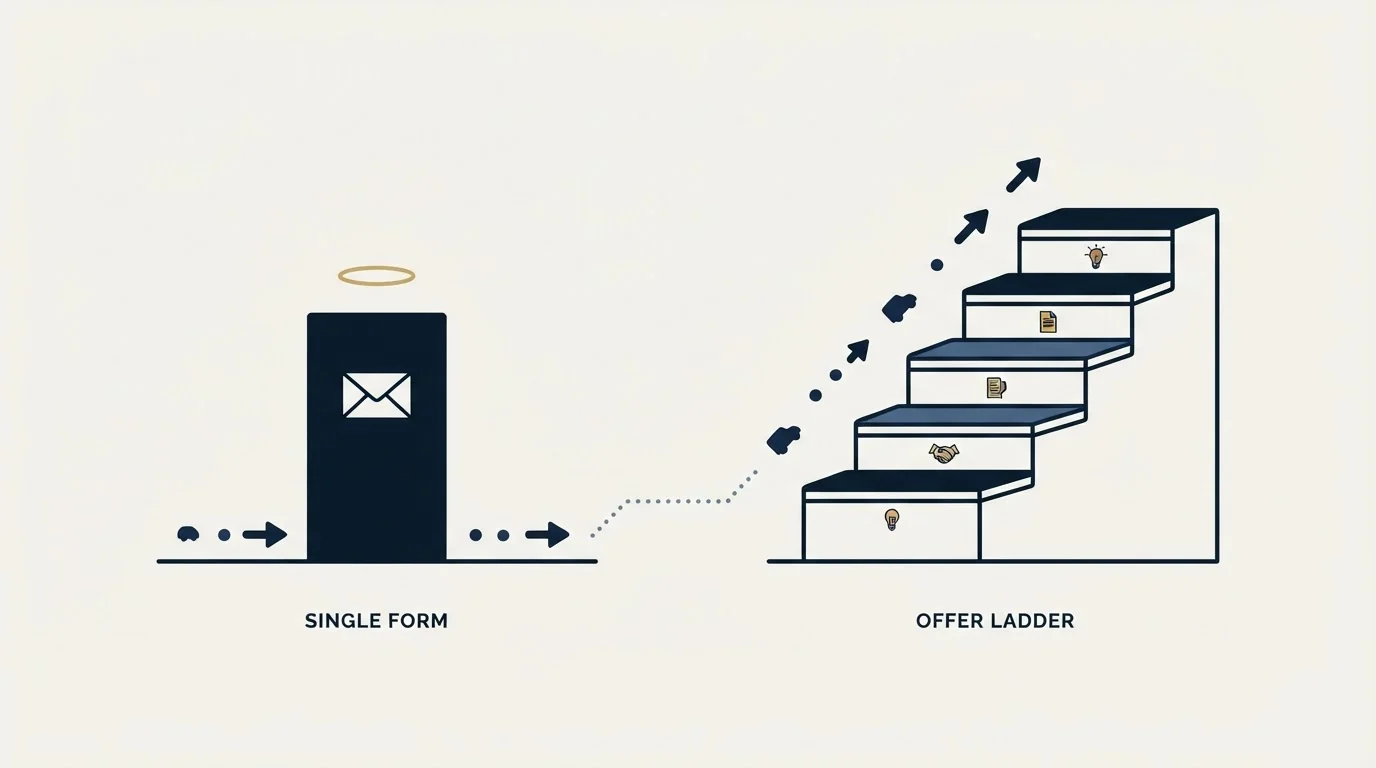
The single most common structural fault is having exactly one thing a visitor can do, aimed at the small fraction of visitors who are ready to talk to sales today. Everyone else has no available action, so they leave with no trace.
A working site offers something proportionate at each stage of readiness. A visitor comparing vendors wants evidence. A visitor with a live problem wants a specific answer. A visitor ready to buy wants a calendar. Those are three different asks, and a site with only the third one converts only the third group.
Since offers vary by readiness, a webinar registration is worth examining separately as a lead asset, explored in webinar sign-ups as lasting lead assets.
- Yes: A concrete resource that solves part of the problem without a call
- Yes: A calculator, assessment or diagnostic that returns a personalised answer
- Yes: Detailed proof: case detail, worked examples, real numbers where you have them
- Yes: A short, specifically framed conversation with a named purpose
- Yes: Direct booking on a calendar for visitors who are already decided
- No: A generic 'Contact us' form as the only route
- Depends: A newsletter signup used as the primary conversion goal
The middle option deserves more attention than it gets. An interactive tool that gives a visitor a real answer about their own situation converts because it is worth completing on its own terms, and it produces context that makes the follow-on conversation better. We wrote about that pattern in try before you buy lead magnets.
Whichever offers you pick, the number of form fields should match the value of what is being offered. Asking for a phone number and a company size in exchange for a PDF is a trade most visitors decline, and every field is a chance to reconsider.
There is a countervailing point worth holding at the same time. Fields that qualify are not pure friction, because a form that produces a hundred submissions nobody can use is worse than one producing twenty that route straight to a conversation. The resolution is to put the qualifying fields on the high-commitment offers, where the visitor already expects to give something, and keep the low-commitment offers to an email address. A single form design applied everywhere gets one of the two wrong by construction.
The pages that do the work
Traffic distribution on B2B sites is lopsided, and the pages that convert are rarely the ones that get redesigned. Four page types usually carry the load.
The homepage does one job: telling a visitor within seconds what the company does and for whom. It converts few people directly and disqualifies many, which is useful.
Service or solution pages are where intent is highest, because the visitor arrived with a specific problem. These deserve their own offer rather than inheriting the site-wide contact form, and they are the pages where a mismatch between the headline and the search that brought someone there does the most damage.
Intent signals shift by industry too; commercial construction treats the project as the real targeting unit rather than the company that eventually wins it.
Proof pages carry the visitor who is comparing you against alternatives. Detail beats polish here: named situations, real constraints, and numbers where they exist. A page of logos answers no question a serious buyer is asking.
Pricing or commercial pages, where they exist at all, are the ones B2B companies most often omit and most often get asked about. A page that explains how pricing works, even without publishing figures, removes a reason to leave and go looking elsewhere.
The step nobody owns
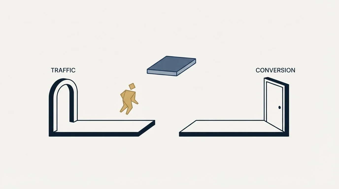
Speed of response to an inbound enquiry is the cheapest available improvement at most B2B companies, and it is routinely the worst-run part of the process. Submissions land in a shared mailbox, get looked at the next working day, and reach a person on the third. By then the visitor has spoken to someone else or the moment has passed.
Fixing this needs no design work. It needs a named owner, a target response time, and a check that the routing actually works, including from mobile and including outside office hours. Test your own form quarterly by submitting it and timing what happens. Most companies who do this for the first time find something broken.
The failures are usually mundane rather than dramatic. A notification rule that stopped matching after someone changed a field name. A shared inbox whose owner left. A spam filter quietly holding submissions from free email domains, which is a large share of small business enquiries. None of these announce themselves, and each one looks exactly like a period of low demand from the outside.
How this fits with outbound rather than replacing it
The website conversation is usually framed as an alternative to outbound, and for a B2B company running both, the two are more entangled than that framing suggests.
Two connections matter. First, almost every prospect you contact directly will look you up before replying, so your site is part of the outbound program whether or not you planned it that way. A message that lands well followed by a site that fails to confirm the sender is credible loses the reply. Second, the offers that work on a website are frequently the same offers that work in a message, and building them once serves both.
The distinction between creating demand, capturing it and converting it is the useful frame here, and we set it out in demand creation versus capture versus conversion. A site is largely a capture and conversion instrument: it works on demand that already exists, which is why a company with no awareness in its market can build an excellent site and see very little from it. That is not a failure of the site. It is a demand problem the site cannot solve on its own.
Our position on the outbound half is narrow and worth stating: one message per campaign, built on one premise, sent once. A later approach is a separate campaign with its own premise. That constraint puts more weight on the site, because a prospect who checks you out and finds nothing that speaks to them is a reply that never arrives, and there is no second message to recover it.
What to measure

Sessions and bounce rate say almost nothing about whether a site generates leads. Three measurements do.
Conversion rate by page, so you can see which pages carry their weight and which are decorative. Qualified conversation rate from submissions, because a form that produces volume and no qualified conversations is a targeting problem dressed as a success. And time from submission to first human response, which is usually the number that improves fastest.
The same denominator problem shows up offline, where field programmes divide cost by qualified meetings rather than by the seats that were filled.
Then work the arithmetic backwards from a deal to a visitor, so you know what a conversion is worth before deciding what to spend on traffic. That calculation is in cost per lead in B2B, and the structural version of the same diagnosis is in four frameworks for broken lead generation.
If you want the outbound half built to match, see what a first campaign looks like.
Page speed guidance verified as of mid-2026. Verify current thresholds with the source before relying on them.
Frequently asked questions.
Frequently asked questions- What actually makes a website a lead generation website?
- Every page is built so a qualified visitor can identify themselves and start a conversation, and pages are judged on that rather than on sessions. In practice that means navigation organised around the visitor's problem, a specific offer matched to each page's intent, copy written for a named buyer, and a defined owner and response time for submissions.
- How many form fields should a B2B lead form have?
- Match the fields to the value of what is offered. A PDF that asks for a phone number and company size is a trade most visitors decline. Qualifying fields are not pure friction though, since submissions nobody can use are worse than fewer good ones, so put those fields on high-commitment offers and keep low-commitment offers to an email address.
- Should we redesign the site to get more leads?
- Usually not first. The largest single loss tends to be a headline written in internal vocabulary that a visitor cannot decode in a few seconds, which is a copy problem. After that come having only one available action, form friction and load speed, and response time. Each is cheaper to fix than a redesign and compounds into the next.
- Does a good website replace outbound?
- No, and the two are more entangled than the framing suggests. A website works on demand that already exists, so a company with little awareness in its market can build an excellent site and see very little. Separately, almost every prospect contacted directly will look you up before replying, so the site is part of the outbound programme either way.
About the author.

Ben Carden is CRO at RevenueFlow, which builds and operates outbound revenue engines for B2B companies. Previously at Gartner Enterprise. Studied at London School of Economics.
Ben Carden · CRO
Connect on LinkedIn →Explore more.
Ready to scale your outreach?
We build GTM engines that book real meetings. See the receipts.
Related articles.
Allbound: Merging Inbound and Outbound
Allbound runs inbound and outbound as one motion. Merging them creates two decisions: what a signal may trigger, and who is credited when both touched the deal.
5 ABM Campaign Examples and How Each One Is Built
Five worked account-based campaign examples, each built on the same five fields: account set, tier, plays in order, owner and handoff, and the exit condition.
Two Agencies, One Target List: Who Owns Which Accounts
Two outbound suppliers on one market will contact the same companies unless the buyer splits it first. How to cut the list, run the exclusion feed and check the overlap.
Last Outbound Agency Did Not Deliver: Locating the Failure
The leads were bad names a symptom and no stage. Four places an outbound engagement fails, the counts that separate them, and what to change in the next purchase.
HR Lead Generation: The Renewal Clock and Who Signs
An HR buyer who agrees with every word still cannot act outside their own renewal window. Which triggers are observable, and who signs.
IT Lead Generation: The Buyer Runs Your Playbook
Technology buyers evaluate outbound for a living, and their purchases carry a security review nobody in your meeting owns. Which triggers are real.