Drawing a Sales Process Flowchart That Contains the Exits
A whiteboard row of boxes draws the happy path, which is the part nobody needed help with. Four shapes, swimlanes, exit states, and what a diagram cannot show.
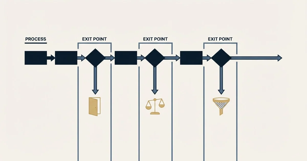
A sales process flowchart is worth drawing when it carries the decisions and the exits rather than only the successful path. Four shapes cover it, every decision needs at least two labelled arrows leaving it, and every path must end in a named state including disqualified.
Key takeaways
- A decision diamond with one exit is not a decision, and its absence is why unqualified deals sit in pipelines with nowhere to go.
- Drawing the process in swimlanes makes handovers countable, and each lane crossing is a place context is transferred deliberately or lost by default.
- Outbound belongs in its own diagram meeting the sales process at one labelled acceptance test, because the two ends differ by orders of magnitude in volume.
- No diagram shows duration, volume or whether the criteria behind a decision are real, so read it beside the numbers rather than instead of them.
Reviewed and updated August 28, 2026
Somebody draws the sales process on a whiteboard roughly once a year. It is a row of boxes with arrows between them, it takes twenty minutes, everyone agrees it is accurate, and it is filed and never opened again. The drawing was not wrong. It was just a picture of the happy path, and the happy path is the part of the process nobody needed help with.
That once-a-year whiteboard sketch only captures the happy path, while mapping deals from closed records shows how deals actually moved.
A sales process flowchart earns its keep when it contains the decisions and the exits, because those are where deals actually go. This page covers what to put in one, the notation that survives contact, the four shapes worth knowing, and the specific things a flowchart cannot show you no matter how carefully it is drawn.
A sales process workflow is this same diagram with the automation attached: the flowchart says what has to happen, and the workflow says which of those transitions the CRM performs on its own. Which of them should be automated at all is worked through in workflow automation in a CRM.
What a flowchart adds over a written process
A written process is a list. A flow chart is a list plus the branches, and the branches are the content.
The seven-step sales process explains why a linear list of seller activities works as a teaching aid but hides whether anybody is actually buying.
The moment you draw a decision diamond you have to answer a question the list let you dodge: what happens to the deals that go the other way. A list can say "qualify the opportunity" and stop. A diagram has to show where the unqualified ones go, and the honest answer for most companies is that nobody knows, which is exactly the finding worth having.
The second thing a diagram forces is ownership at each transition. An arrow crossing from one lane to another is a handover, and handovers are where information is lost. Drawing them makes the count visible, and the count is usually higher than anyone expects.
The four shapes, and the only ones you need
Formal process notation has dozens of symbols. Sales processes need four, and adding more reduces the number of people who can read the result.
- Rounded rectangle: a start or an end state
- Rectangle: an action somebody performs
- Diamond: a decision with named criteria
- Arrow: a transition, labelled with the condition that causes it
- Every end state must be named, including the unpleasant ones
- Who performs it, not just that it happens
- What the criteria are and who applies them
- Every diamond needs at least two labelled arrows leaving it
The last row is the discipline that makes the exercise worth doing. A decision with one exit is not a decision. If your diagram has a qualification diamond with a single arrow leaving it marked "qualified", the process has no disqualification path, and in practice that means unqualified deals stay in the pipeline indefinitely because there is nowhere for them to go.
Swimlanes, and the handover count
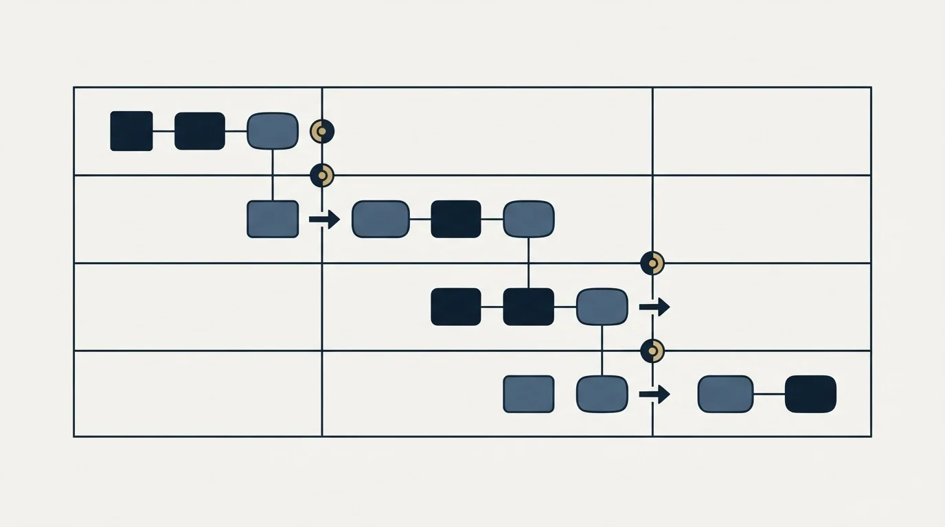
Draw the diagram in horizontal lanes, one per role: marketing, whoever books the meetings, the account executive, sales engineering, legal, finance. Put each box in the lane of whoever performs it.
Then count the arrows that cross a lane boundary. That number is the number of handovers in your process, and each one is a place where context has to be transferred deliberately or lost by default. Most teams are surprised by the count. A moderately complex B2B process with an outbound function, an AE, a technical resource and a procurement step will have six or more.
Each crossing wants two things written next to it: what the receiving party needs in order to start, and what happens if it is not there. A meeting handed to an AE with a company name and a calendar invite forces the buyer to repeat a conversation they already had, which is the fastest way to spend the goodwill the first conversation produced. What a receiving AE actually needs is covered in running a discovery call that disqualifies well.
Where outbound joins, and why it is a separate diagram
The most common mistake in these drawings is bolting the outbound sequence onto the front of the sales process as three more boxes.
Prospecting has its own flow with its own states, and its own exits, and its volumes are three orders of magnitude larger. Drawing targeted, contacted, replied and meeting-booked as peers of proposal and contracting produces a diagram whose left-hand end describes fifty thousand records and whose right-hand end describes eleven.
Keep them as two diagrams that meet at one clearly labelled junction.
- Step 1Outbound flow ends
A specific person agreed to a specific business conversation and attended it
- Step 2Acceptance test
Does the account meet the criteria written down before anyone was contacted
- Step 3Accepted
The deal enters the sales process at its first stage and becomes forecastable
- Step 4Rejected
Recorded with a reason from a fixed list, and the reason distribution is read monthly as a targeting instruction
That rejection path is the arrow most diagrams omit, and omitting it has a predictable consequence: rejections get argued individually and never counted, so the targeting never improves. The boundary two teams negotiate covers what the acceptance step is actually asserting and why the bar drifts with the calendar when it is not written down.
Exit states, and the ones people forget
Every path in the diagram has to end somewhere named. Four end states cover almost everything, and two of them are usually missing.
Won and lost are always drawn. Lost should carry a reason code from a fixed list rather than free text, because free text cannot be counted and an uncountable loss reason teaches nobody anything.
Disqualified is the first commonly missing one. It is different from lost: lost means they considered it and chose otherwise, disqualified means we established they were never the right buyer. Merging the two destroys the only signal that tells you whether your targeting or your selling is the problem.
Stalled is the second, and it should be a state rather than a stage. A deal that has stopped moving has not advanced along the path, so representing it as a further box implies progress that has not happened. Draw it as a flag applied to a deal sitting in whichever box it genuinely occupies, with a revisit date and an owner.
What a flowchart cannot show

Three things matter to a sales process and are invisible in any diagram of it, which is worth knowing before treating the drawing as a full description.
Duration. A diagram shows order and says nothing about the twenty-six days deals spend waiting at one box. Time in step is where most process pathology is visible, and it needs a table rather than a picture.
Volume. Every arrow looks the same width. In reality one path carries eighty percent of deals and another carries three, and effort spent tuning the second is close to wasted. Annotate the arrows with counts from your own closed deals if you want the diagram to inform priorities.
Whether the criteria are real. A diamond labelled "qualified" looks identical whether the criterion behind it is a written definition or a feeling. The drawing is a map of intentions, and only the records show whether those intentions are being applied. That distinction is the same one that separates a pipeline stage from a mood, and it is worked through in pipeline stages that earn their place.
Keeping it alive
Most of these diagrams die because they are drawn in a tool nobody else has, exported as an image, and pasted into a document that is never edited.
Three habits keep one useful. Store the editable source somewhere the whole team can open, not just an exported picture. Put a date and an owner on the diagram itself, so a reader can tell whether they are looking at the current process or last year's. And review it at the same moment you review the process, which for most teams is once or twice a year at a period boundary, because a diagram that disagrees with the CRM is worse than no diagram: people follow the CRM and quote the picture.
The version that gets used is almost always simpler than the version that gets drawn first. If the diagram does not fit on one page at readable size, it is describing more branches than anyone will hold in their head, and the fix is to draw the main path on one page and give the exceptional branches their own.
Where we differ from standard practice
Much of the advice in this space reflects how outbound is commonly run, and since this page sits on our site it is worth naming the difference.
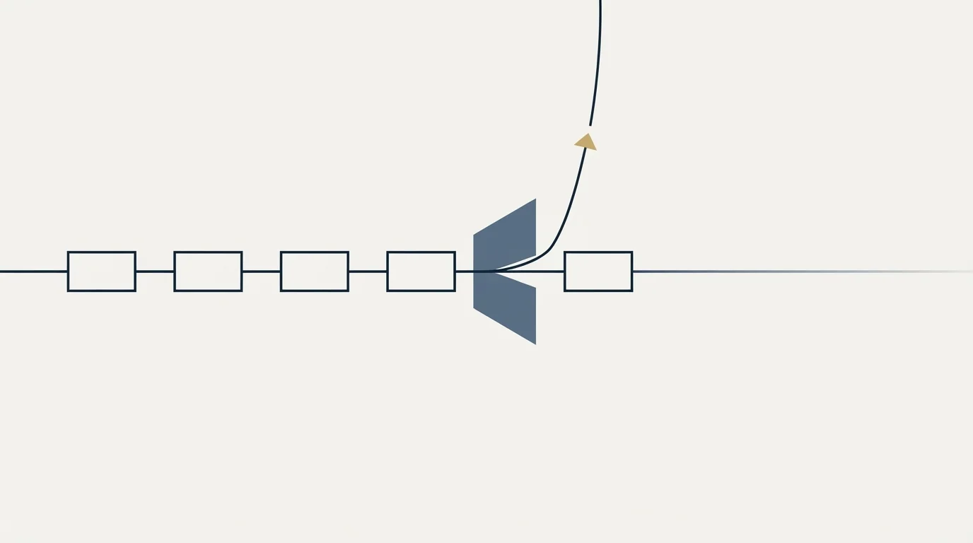
Templates for the front of the process almost always draw a loop: send, wait a few days, send again, wait again, exit after N attempts. We do not run that loop. Our diagram has one send per campaign, no bumps and no thread replies, and where an audience does not respond the next approach is a separate campaign with a genuinely different premise rather than another pass through the same box. The reasoning is mechanical: a repeat message reaches the population that already saw the first and chose not to answer, which is the population most likely to complain, and the reputation cost lands on the sending domain across everything else it sends. The full argument is in our write-up on why we stopped using follow-ups. The cost we accept is fewer contacts per prospect. The full argument, including what it costs us, is in why we stopped using follow-ups.
The short version
A sales process flowchart is worth drawing when it contains the decisions and the exits rather than only the happy path. Use four shapes, put every box in the lane of whoever performs it, and require at least two labelled arrows out of every diamond. Count the lane crossings, because each one is a handover with a context cost.
Draw outbound as a separate flow that meets the sales process at one labelled acceptance test, and give rejections a reason from a fixed list. Name every end state, including disqualified, and treat stalled as a flag rather than a box. Remember that no flow chart shows duration, volume or whether the criteria behind a decision are real, so read it beside the numbers rather than instead of them.
If the diagram is fine and the left-hand end is empty, the constraint is supply rather than process: see what a first campaign produces.
Frequently asked questions.
Frequently asked questions- What shapes should a sales process flow chart use?
- Four are enough: rounded rectangles for start and end states, rectangles for actions somebody performs, diamonds for decisions with named criteria, and labelled arrows for transitions. Adding more notation reduces the number of colleagues who can read the result, which defeats the purpose of drawing it.
- What is a swimlane and why use one?
- A horizontal band representing one role, with every action drawn in the lane of whoever performs it. The value is the count of arrows crossing lane boundaries, because each crossing is a handover. Writing what the receiving party needs, and what happens when it is missing, next to each crossing is the useful part.
- Which end states do people forget?
- Disqualified and stalled. Disqualified is different from lost: lost means the buyer considered and chose otherwise, disqualified means they were never the right buyer, and merging them destroys the signal that separates a targeting problem from a selling one. Stalled belongs as a flag on a deal rather than as a box.
- Should the outbound sequence be in the same sales process flow diagram?
- No. Prospecting has its own states and volumes thousands of times larger, so drawing targeted, contacted and replied as peers of proposal and contracting produces a diagram nobody can read. Keep two diagrams meeting at one acceptance test, and give the rejection path a reason drawn from a fixed list.
About the author.

Ben Carden is CRO at RevenueFlow, which builds and operates outbound revenue engines for B2B companies. Previously at Gartner Enterprise. Studied at London School of Economics.
Ben Carden · CRO
Connect on LinkedIn →Explore more.
Ready to scale your outreach?
We build GTM engines that book real meetings. See the receipts.
Related articles.
Sales Process Mapping: Draw What Happens, Not What Should
Every company has two processes: the one people describe and the one the records show. Mapping is worth the days it takes when it captures the gap between them.
The Seven-Step Sales Process: What Each Step Assumes
Prospecting through follow-up, walked one box at a time. Each of the seven steps carries an assumption about the buyer, and most of them have quietly stopped holding.
SFDC Sales Process: The Picklist Decides What a Stage Is
In Salesforce a sales process is a named subset of the Opportunity Stage picklist. What it enforces, what it silently leaves behind, and the order to build it in.
Optimising a Sales Process: Measure First, Then Delete
The step that feels worst is rarely the one costing most. Three measurements that find the real bottleneck, four causes worth checking, and why deleting beats adding.
A Repeatable Sales Process: What Transfers
Repeatable means somebody else can run it and get a similar result. What a written process carries, what it quietly leaves behind, and how to measure it at ramp.
Sales Kickoff Meeting: The Decisions It Has to Leave With
A kickoff is the one moment a whole sales organisation can change at once. The four decisions it has to publish, and the week-six check that tests them.