Email Finder Tools: How to Compare Them on Your Own List
Published coverage claims are not comparable between lists. The test that produces a real answer in an afternoon, and what is genuinely comparable: how they bill.
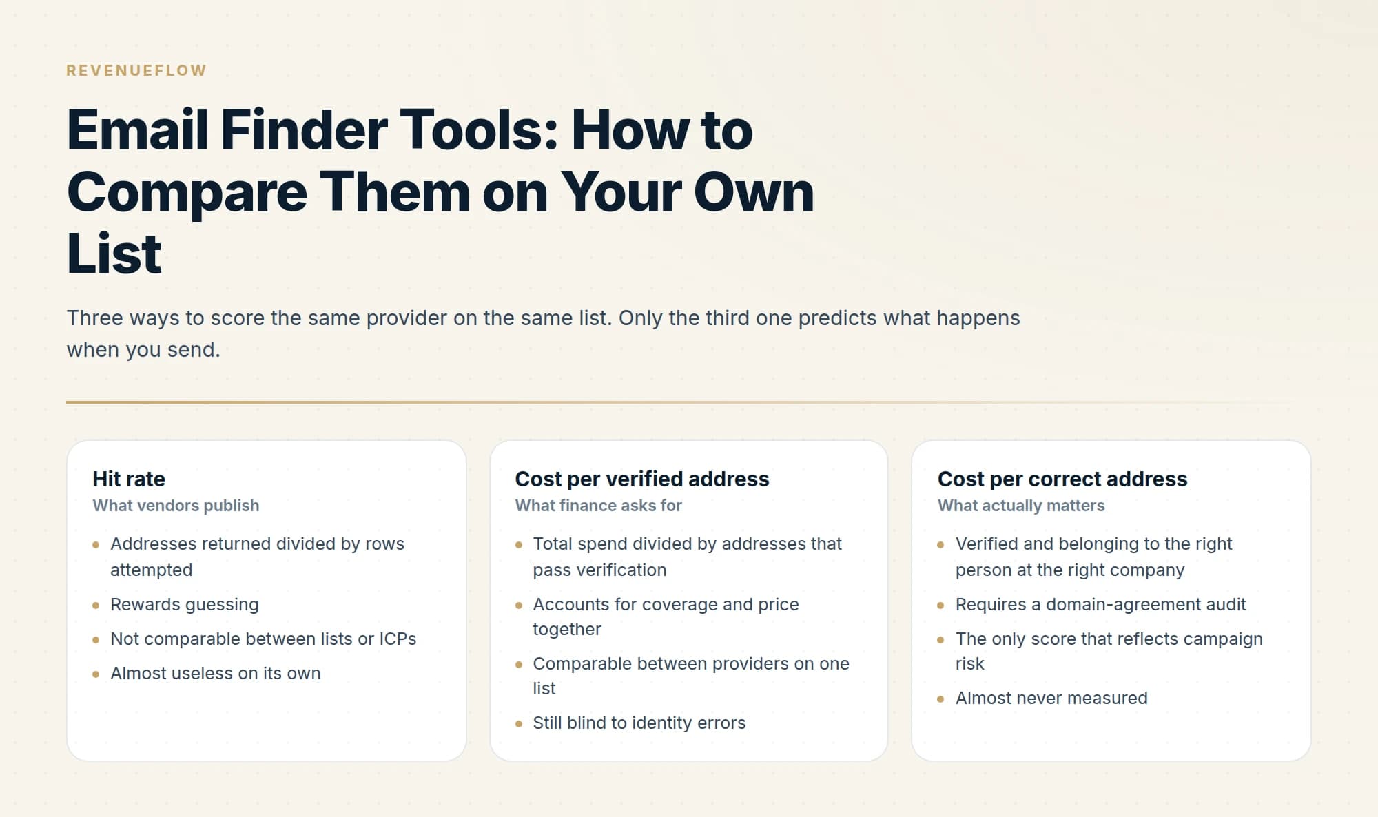
Coverage is a property of your list rather than of a provider, so published hit rates are not comparable. Test candidates on the same rows on the same day, verify with one neutral verifier, and score cost per verified address. Then audit resolved domains against each row's company, because a valid mailbox can belong to the wrong person.
Key takeaways
- Hit rate rewards providers that guess, so score cost per verified address instead, and then cost per correct address.
- Run every candidate on the same rows on the same day, because coverage shifts as data ages and a sequential test compares providers and time at once.
- Never score a provider using its own verification verdict; use one neutral verifier for all of them.
- MillionVerifier lists 1 million verifications for $449 and Prospeo runs from roughly $0.018 to $0.012 a credit, so verification is around thirty times cheaper than a lookup.
Reviewed and updated September 5, 2026
Every email finder publishes a coverage claim, and none of them are comparable. Coverage depends on which countries your list is in, how senior the titles are, how big the companies are, and how recently the people changed jobs. A provider that resolves 80% of US software executives might resolve 30% of European operations managers at manufacturers.
So the only ranking that means anything is the one you produce on your own list. Here is how to run that test properly, and what the market looks like on the things that genuinely are comparable: published pricing, billing models, and how each provider behaves when it is uncertain.
The metric almost everyone gets wrong
Hit rate is the wrong headline number. Three others matter more.
An email address people finder is this same product under a consumer-sounding name, and the searches that phrase attracts split between B2B finders and reverse email lookup services, which resolve a person from an address rather than an address from a person.
Cost per verified address, not cost per lookup. A provider charging half as much with half the coverage costs the same, and consumed twice the rows of your list to get there.
Cost per correct address. A returned address that is valid but belongs to the wrong person is worse than a miss, because a miss costs a credit and a wrong hit costs a prospect. This is the number nobody measures, and it needs its own test, below.
Behaviour under uncertainty. Some providers return a guessed pattern with no verification and count it as a hit. Others return nothing rather than guess. On a headline coverage chart the first provider looks better and on a bounce report it looks much worse.
- Addresses returned divided by rows attempted
- Rewards guessing
- Not comparable between lists or ICPs
- Almost useless on its own
- Total spend divided by addresses that pass verification
- Accounts for coverage and price together
- Comparable between providers on one list
- Still blind to identity errors
- Verified and belonging to the right person at the right company
- Requires a domain-agreement audit
- The only score that reflects campaign risk
- Almost never measured
Running the test on your own list
The test is cheap and takes an afternoon. The discipline is in the controls.
- Step 1Draw a representative sample
300 to 500 rows sampled from the list you will actually work, including the hard segments rather than only the easy ones.
- Step 2Run every provider on the same rows, same day
Coverage shifts as data ages, so a sequential test across weeks compares providers and time at once.
- Step 3Verify all results with one neutral verifier
Never score a provider using its own verification verdict.
- Step 4Score cost per verified address
Total spend for that provider divided by its addresses that passed verification.
- Step 5Audit identity on a sample of hits
Check the resolved domain against the company on the row, and read the mismatches by hand.
Two controls carry most of the value. Same rows, same day removes the two variables that otherwise dominate. And one neutral verifier for everybody stops you comparing providers through their own marking.
On the last step: do not skip it because the bounce rate looked fine. A valid mailbox at the person's previous employer passes verification and delivers cleanly. When we audited resolved domains against the company on each row, lanes resolved through a cheap verify-first waterfall showed genuine misjoins in only about 1.4% of flagged rows, while one lane resolved through a bulk enrichment provider showed demonstrable defects in roughly a third of them. Nothing in the delivery data distinguished the two.
What is genuinely comparable: how they bill
Published pricing and billing models are checkable, and they differ in ways that change the economics more than coverage does.
MillionVerifier is a verifier rather than a finder, and it anchors the cheap end of any stack: 1 million verifications for $449, roughly $0.00045 each, with credits that "never expire". Its billing model matters for waterfall design, because it states you "only pay for good and bad emails and not for risky (unknown and catch-all) emails". If unknown results are free, brute-forcing several candidate patterns per person is close to free too.
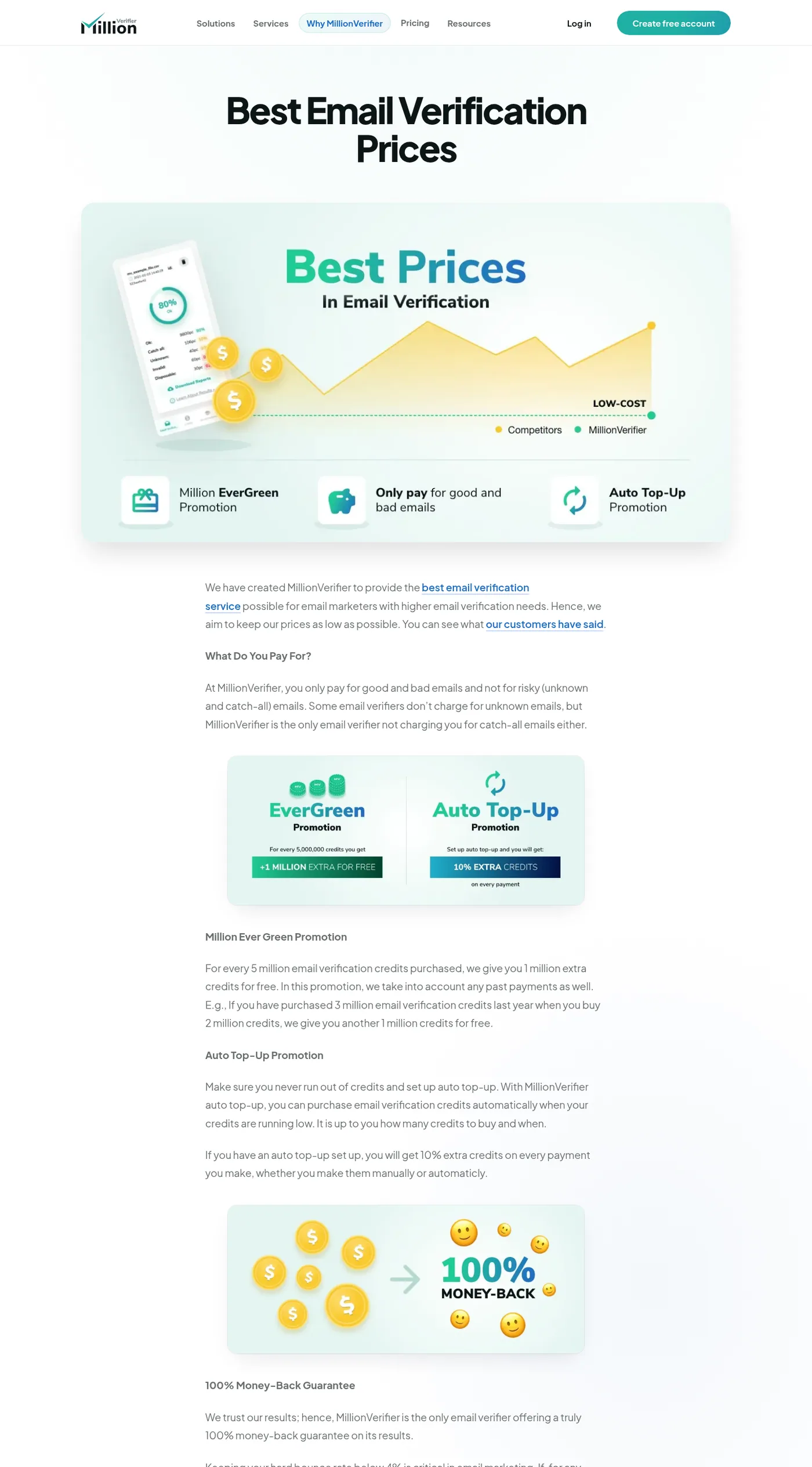
MillionVerifier's published pricing explainer, captured mid-2026.
Prospeo publishes a straightforward per-seat credit ladder: a free tier with 100 credits a month, Starter at $37 per user per month billed yearly ($49 monthly) for 24,000 credits a year, Growth at $74 ($99 monthly) for 60,000, and Pro at $187 ($249 monthly) for 180,000. That works out between roughly $0.018 and $0.012 a credit depending on tier.
Read again on 2 September 2026, the same page also publishes the monthly side of those allowances at 100 credits a month on the free tier, 2,000 on Starter, 5,000 on Growth and 15,000 on Pro, with extra credits sold as an add-on starting at 1,000 credits for $10.
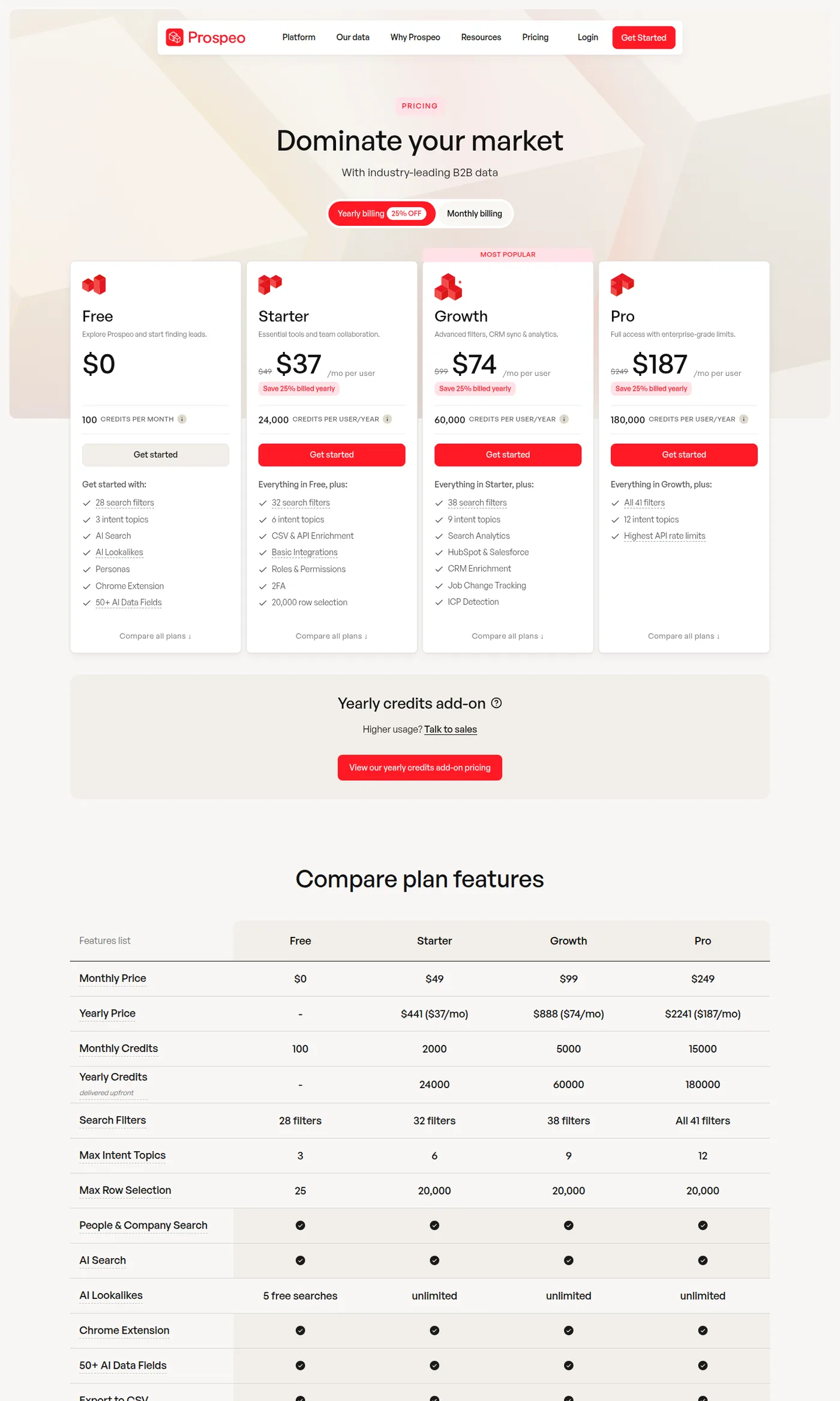
Prospeo's published pricing, captured mid-2026.
Clay is not a finder but a marketplace and workflow layer over many of them, priced in data credits from $0.0452 down to $0.0383. You pay a margin for orchestration and for not needing a contract with each underlying provider. Where you already hold a direct contract, Clay lets you bring your own API key on every tier, which converts a credit-priced lookup into a much cheaper action-priced one. The full breakdown is in our Clay pricing analysis.
Findymail is the third stage in our own stack. Its pricing page sits behind a bot-protection interstitial that we could not read reliably during writing, so we are not quoting figures for it here; check its pricing page directly.
The billing terms worth reading before you sign
Three clauses affect real cost more than the headline rate.
Do you pay for misses? A provider that charges only for found addresses is cheaper than its rate card implies on a hard list, and the difference grows as your list gets harder. GetProspect is one such provider, and its found-only meter, its capped rollover and its two annual figures are dated on this site's GetProspect pricing page.
Do credits expire? Monthly credits that expire punish uneven usage, which is what outbound actually looks like. Credits that never expire, or that roll over, are worth a premium if your volume is lumpy.
Is it per seat or per account? Per-seat pricing with per-seat credit pools is expensive for a team where one person runs enrichment for everyone.
Meters decide cost elsewhere in the stack too, and seat pricing against contact pricing shows how Keap bills by the contact while Pipedrive bills by the seat.
The stack we run, and why
What an email address finder by domain returns is not the same object as what a per-person finder returns, and the difference is the reason this order works: a domain search hands back the company's address FORMAT plus whatever addresses are already known there, while a finder resolves one named person. The format is the reusable asset, because it applies to everybody else at that company, which is exactly what the brute-force stage tests against.
Our own order is MillionVerifier brute-force first, then Prospeo, then Findymail. The logic is entirely the cost ratio: verification is roughly thirty times cheaper than a paid lookup, so guessing patterns and checking them resolves a large share of the list before any finder is paid, and every address resolved that way arrives already verified.
Once verified addresses are resolved, staffing and recruiting teams still need a place to send them, a need covered in the roundup of email sending tools for recruiting teams.
We retired a bulk enrichment provider in mid-2026 and did not replace it. What ended it was not price but the identity-error rate above, which no amount of verification catches.
Two things we do not do. We do not use Scrubby, on a long-standing internal rule. And we do not add a fourth paid stage: past the third provider the marginal cost per additional address climbs while quality falls, so the remainder gets banked and volume comes from fresh sourcing instead. The reasoning is in the waterfall enrichment guide.
- Yes: You have run a same-day, same-rows test on your own list
- Yes: You scored cost per verified address rather than hit rate
- Yes: You audited resolved domains against the row's company
- Yes: You know whether the provider charges for misses
- No: You chose on a published coverage percentage
- Depends: Your list is mostly non-US, where coverage varies most
Read the result as an order, not a winner
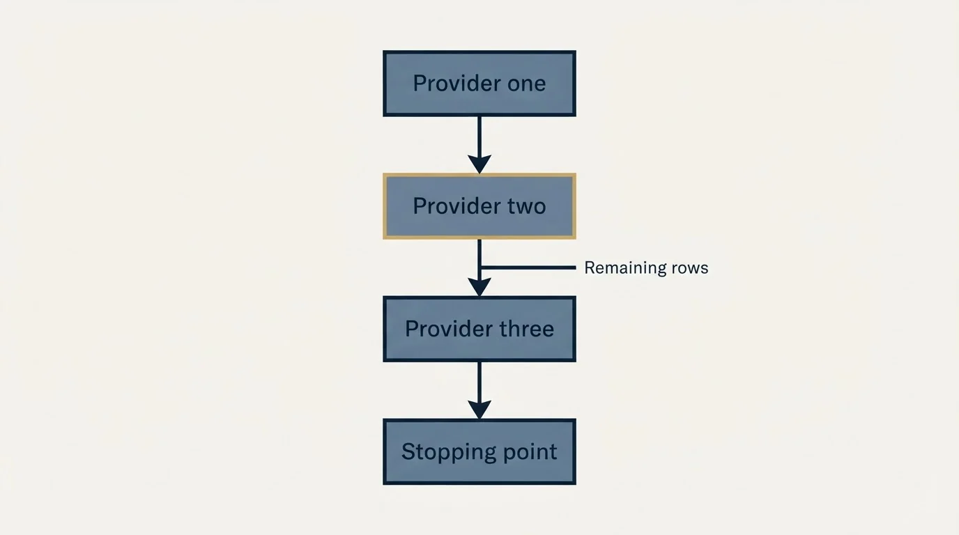
The output of a good bake-off is rarely one provider. It is a sequence.
Providers overlap less than their marketing implies, and the rows one misses are frequently the rows another resolves. So the question the test answers is not which provider is best but which should go first, second and third, and where to stop. A provider that resolves only 15% of your list can still earn a place at stage three if those 15% are rows nothing else reaches and the cost per usable row is acceptable.
Compute the marginal contribution rather than the standalone rate. Take your best provider, then ask how many additional rows the second one resolves among the rows the first one missed, and what those additional rows cost. Repeat for the third. The curve flattens fast, and the point where the marginal cost per additional address stops being worth paying is your natural stopping point.
That is also the number that tells you when to stop adding vendors. If a fourth provider recovers a small fraction of the remaining tail at a rising unit cost, the tail is better banked than bought.
Coverage varies most where you are least likely to test
One bias worth designing around: most published comparisons, and most casual internal tests, are run on US technology contacts, which is the easiest segment in the market.
Fintech email sending platform picks covers the sequencing tools worth pairing with a verified list once your finder stack is sorted.
Coverage degrades on non-US contacts, on smaller companies without a strong web presence, on non-technology industries, and on people who changed jobs in the last few months. If your ICP sits in any of those, a test drawn from your easiest accounts will pick the wrong provider and set a budget you will overrun.
Sample deliberately across the segments you actually sell into, and report the result per segment rather than as one blended number. It is common for the right answer to differ by region, in which case the correct configuration is a different chain per segment rather than one compromise chain for everybody.
Why we rewrote the question
The obvious version of this article ranks providers by hit rate on a shared test list. We did not run one, so there is no table of percentages here, and a ranking taken from someone else's test would be a ranking of their ICP rather than yours.
What survives that constraint is more useful anyway: the billing models are public and checkable, the cost ratio between verification and finding is stable, and the test that produces a real answer for your list takes an afternoon. Run it on the segments you actually sell into, including the hard ones.
For where the finders sit in a full build, see the Clay enrichment guide, and for verification and deliverability downstream, the email verification tools roundup.
The short version
Ignore published coverage claims, because coverage is a property of your list rather than of the provider. Test candidates on the same rows on the same day, verify everything with one neutral verifier, and score cost per verified address. Then audit resolved domains against the company on each row, because a valid mailbox belonging to the wrong person passes every other check you run.
If you would rather receive a verified list and a running campaign than build the bake-off, you can see what a campaign would look like for your market.
Provider pricing verified against each vendor's own published pages as of mid-2026. No Findymail figures are quoted because its pricing page was not reliably readable during writing. Accuracy figures are from our own internal audits of client enrichment runs. Verify current terms with vendors before relying on them.
Sources: MillionVerifier pricing, MillionVerifier prices explainer, Prospeo pricing, Clay pricing
Frequently asked questions.
Frequently asked questions- What is the best email finder tool?
- There is no answer that transfers between lists. Coverage depends on geography, seniority, company size and how recently people changed jobs, so a provider that resolves most US software executives may resolve far fewer European operations managers. The useful question is which performs best on your list, which takes an afternoon to establish.
- How do I test email finders fairly?
- Draw 300 to 500 rows representative of the list you actually work, including the hard segments. Run every provider on those same rows on the same day, verify all results with one neutral verifier rather than each provider's own verdict, and score total spend divided by addresses that passed verification.
- Why is hit rate a bad way to compare providers?
- It rewards guessing. Some providers return a pattern-derived address without checking it and count that as a hit, which looks strong on a coverage chart and weak on a bounce report. It also ignores price, so a cheaper provider with half the coverage can cost exactly the same per usable address.
- What is cost per correct address?
- Cost per address that is both verified and belongs to the right person at the right company. A valid mailbox at someone's previous employer passes verification and delivers cleanly, so neither verification nor bounce data catches it. Auditing resolved domains against the company on each row is what surfaces it.
About the author.

B2B cold email experts helping companies generate qualified leads through done-for-you outreach campaigns.
RevenueFlow Team
Explore more.
Ready to scale your outreach?
We build GTM engines that book real meetings. See the receipts.
Related articles.
Seamless.AI Email Finder: How It Works, What a Credit Buys
How Seamless.AI's email finder resolves a contact in real time, what one Universal Credit buys, the Total AI score on every address, and what the Chrome extension reads.
LeadGibbon Pricing: Three Monthly Plans, No Annual Tab
LeadGibbon publishes three monthly plans and no annual rate. The dated ladder, the verified-emails-only meter, the rollover rule, and what the page does not publish.
PersistIQ Pricing: A Demo Form Where the Ladder Was
PersistIQ's pricing address serves a demo form and no platform price. What the site does publish, the Luka add-on ladder at both billing states, and how to read a quote.
Enrow Pricing: Three Billing States, Two Currencies
Enrow prices per verified result across monthly, annual and pay-as-you-go tabs in euros and dollars. The ladder, the credit meter and the currency clause.
SalesQL Pricing: Four Plans, Priced Per Credit
SalesQL publishes four plans on a monthly-first pricing page. Here is the dated ladder, the per-profile credit meter, the seat limits, and what the page leaves out.
Social Selling Tools by Job, and the Account-Risk Line
Fourteen social selling tools sorted into six jobs, split by whether each acts through your LinkedIn account or beside it, from the vendors' own pages.