Sales Enablement Metrics: What Happened vs What Changed
Enablement metrics split into activity, behaviour and outcome. Only behaviour answers the attribution question, and it has to be instrumented on purpose.

Three behavioural metrics reveal whether enablement changed seller behaviour in the market: ramp spread against a written competence bar, adherence in a consistent monthly sample of recorded calls, and the time a new seller takes to answer a real buyer question. Activity metrics only show the work happened, and outcome metrics are mediated by hiring and management.
Key takeaways
- The B2B sales metrics that reveal a change in seller behaviour are behavioural: ramp spread, adherence in recorded calls, and time to answer a real buyer question.
- Activity metrics license one claim, that the work happened. Outcome metrics arrive one full sales cycle later, mediated by hiring, management and segment mix, so they cannot carry an attribution argument alone.
- Report ramp as a spread rather than an average, because the gap between the fastest and slowest new seller is what a consistent onboarding path can narrow.
- Read each metric at its own speed: adherence monthly, time to answer quarterly, ramp spread per cohort, and outcome metrics over at least one sales cycle.
Reviewed and updated September 21, 2026
The enablement slide in most quarterly reviews carries course completions, content downloads and a certification percentage. Everyone in the room reads it the same way, which is that the function was busy. Nobody leaves knowing whether anything changed in how sellers behave in the market, and the people presenting it usually know that better than anyone.
That slide is honest about effort: it holds the numbers the function can produce reliably, and every alternative is harder to obtain. The B2B sales metrics that reveal whether enablement changed seller behaviour are harder to collect, and picking sales enablement metrics is mostly the work of deciding how much difficulty to accept in exchange for a number that means something.
Choosing which numbers deserve a place on that slide comes down to distinguishing metrics from decisions, which the broader question of KPI meaning covers in more depth.
Which B2B sales metrics reveal whether enablement changed seller behaviour in the market?
Three behavioural metrics reveal it. Ramp spread, meaning the gap between the fastest and slowest new seller reaching a written competence bar. Adherence to the taught behaviours in a consistent monthly sample of recorded calls. And the time a recently joined seller takes to produce a sendable answer to a real buyer question. Activity and outcome numbers cannot show a behaviour change on their own.
All three are read where the seller actually works, in live conversations and live buyer questions, after the training is over and with nobody from enablement in the room. That is what makes them in-market readings. Teams that call the function revenue enablement, because it serves every customer-facing role and not sellers alone, face the same three classes of number, and the same reasons the familiar ones fail.
Three kinds of number, and only one of them survives a challenge
Every metric in this space falls into one of three classes, and the class decides what a movement in it can be used to argue.
Most enablement reporting lives entirely in the first class and gets challenged from the third. The middle class is where the defensible answers are, and it is the one nobody instruments, because it is the only one that requires setting something up.
Why the outcome numbers cannot carry the argument
Three things sit between an enablement programme and a closed deal, and each of them is larger than the programme.
The first is time. A better onboarding path shows up in closed business one full sales cycle later, and in a business with a long sales cycle that can be two or three quarters after the intervention, by which point the cohort, the pricing and the territory have all moved.
The second is mediation. Everything enablement produces is delivered through a manager and executed by a seller. A programme that was reinforced weekly by one manager and mentioned once by another produces different results in the two teams, and the difference is the manager rather than the programme.
The third is composition. Win rate and quota attainment move with who was hired and which segment was worked. A single strong hire moves a small team's average further than any programme will, in either direction.
None of that makes the outcome numbers useless. It makes them unable to answer the attribution question on their own, which is exactly the question they get put on a slide to answer.
Ramp spread, and how to compute it without a data team
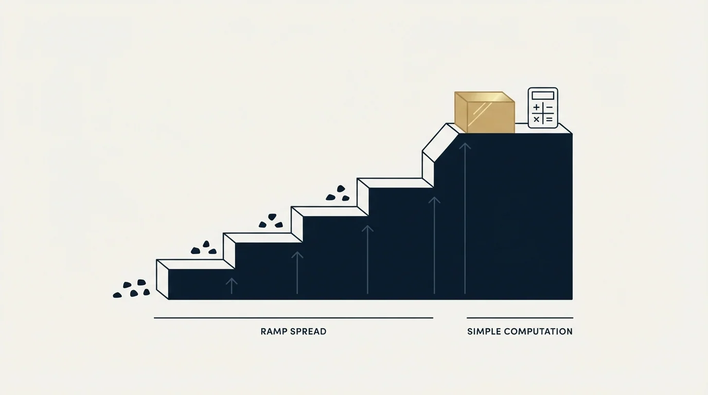
Ramp is the metric enablement has the strongest claim to, on one condition: report the spread rather than the average.
Average ramp time is dominated by hiring quality and by how many people were hired at once. The spread between the fastest and slowest seller reaching a defined competence bar is the thing a programme can genuinely narrow, because narrowing it is what a consistent onboarding path does.
Computing it needs no new tooling.
- Define the bar once, in writing: a specific, checkable event such as a first closed deal, or the first three qualified opportunities accepted by an account executive.
- Take the last two cohorts of new sellers, with each one's start date and the date they hit the bar. A spreadsheet is enough at this size.
- Report the range rather than the mean: the fastest, the slowest and the gap. The gap is the number the programme owns.
- Re-run it one cohort after any change. Anything sooner is measuring the previous programme with a new label on it.
An illustrative example, with invented figures used only to show the shape of the reading: a cohort where the fastest new seller reaches the bar in two months and the slowest in eight has a six-month spread, and a following cohort at three and six months has a three-month spread. The average barely moved across those two invented cohorts while the thing worth fixing halved. Reporting the average would have hidden the entire result.
Behavioural adherence is the only measurement that separates delivered from landed
A programme that was delivered and a programme that landed look identical in every activity metric, and they look different in exactly one place: what sellers say when nobody from enablement is in the room.
Recorded conversations are the instrument. Pick the three behaviours the programme was actually trying to change, define each one so two people scoring the same call agree, and sample a fixed number of calls per seller per month. The sampling matters more than the volume: a consistent small sample read every month tells you about the direction, and an occasional large one tells you about the week it was taken.
This is where the conversation intelligence category earns its place, and where the case for buying it is strongest, because no other tool produces the evidence. What separates the conversation intelligence options is a buying question of its own; the measurement discipline above is the same whichever one is running.
Two failure modes are worth naming in advance. Scoring drifts when the definitions live in someone's head rather than on paper, and the drift is invisible because the numbers stay stable. And a behaviour that is scored becomes a behaviour that is performed, so a rubric that rewards saying a phrase will reliably produce the phrase. Score the outcome of the behaviour where you can: whether the buyer answered the question, rather than whether the seller asked it in the approved words.
Time to answer, the metric almost nobody instruments
The materials half of enablement has one honest measurement, and it takes an afternoon to run.
Collect five questions buyers actually asked last month. Hand them to a seller who joined recently. Time how long it takes them to produce an answer they would be willing to send, and record where the answer came from. Under two minutes each, sourced from the library, means the library is doing its job. Anything longer, or an answer assembled from memory, means the material exists and is not reachable, which for a seller in a live conversation is the same as not existing.
The value of the test is that it is cheap enough to repeat quarterly and specific enough to act on. A single number falls out of it, it moves when the library is reorganised, and it does not move when a new asset is published, which is precisely the distinction the download count cannot make.
The two content numbers worth keeping

Content reporting is where activity metrics are hardest to give up, because the library generates them by itself and they always show growth. Two numbers in that family are worth keeping, and they are both subtractive.
The first is the count of assets not opened in two quarters, reported as a share of the library. It moves in the right direction when material is retired and in the wrong direction when material is published without being retired, which makes it the only content number that resists being gamed by producing more. A library where a third of the material has gone untouched for six months has a retirement problem more than a discoverability problem, and the two want different fixes.
A library filed by the question each piece answers is easier to prune, which is exactly how a collateral library gets sorted rather than by format.
The second is the share of assets carrying a named owner and a review date. This one is a leading indicator for the first: material without an owner is never retired, because nobody has standing to retire it. It also costs nothing to measure, since the field either exists or it does not.
Sales content analytics is the platform name for the dashboard those two numbers sit inside, and the reason to keep only the subtractive pair is that every other number it offers grows when material is published and none of them falls when material should have been retired.
Both numbers are worth reporting quarterly rather than monthly. Content decay is slow, and a monthly reading of a slow number produces noise that invites action where none is warranted.
How often should enablement metrics change?
A reading should change only as fast as the thing underneath it can move. Behavioural adherence is read monthly, time to answer quarterly, ramp spread once per cohort, and outcome metrics over a period at least one sales cycle long. The set of metrics itself should change only when the behaviours the programme is trying to change do.
Behavioural adherence is a monthly number, because a consistent monthly sample is what makes a trend readable. Time to answer is quarterly, because reorganising a library is a quarterly-scale act. Ramp spread is per cohort, and reporting it more often than that means reporting the same cohort twice with a new label. Outcome metrics belong on a period at least one sales cycle long, which in a business with a six-month cycle means twice a year rather than every quarter.
On an illustrative year for a business with a six-month cycle that hires two cohorts, that comes to 12 adherence readings, 4 time-to-answer readings, 2 ramp-spread readings, one as each cohort reaches the bar, and 2 outcome readings.
The failure this prevents is the standing monthly slide that carries every metric at the same frequency. On that slide the slow numbers look flat and get read as inert, and the fast numbers get read as results, which inverts the reliability of the two.
The metrics you will be asked for anyway
Nobody escapes the outcome class. The workable answer is to present it with its companion rather than refusing it.
| Requested metric | Present it with |
|---|---|
| Win rate | The mix of segments worked in the period |
| Quota attainment | A split by tenure, so ramping sellers do not distort it |
| Cycle length | Stage-entry criteria, so a definition change is visible |
| Any outcome movement | A period of at least one sales cycle, and a behavioural measurement beside it |
The last row is the whole discipline in one line. An outcome number and a behavioural number moving together is an argument. An outcome number moving alone is a coincidence with a good story attached, and presenting it that way costs credibility the next time it moves the other way.
Published sales enablement statistics are a different object from the metrics above, and which of them name a population is traced publisher by publisher in sales enablement statistics.
Stage-entry criteria matter more here than they look, because a cycle-length improvement is frequently a definition change wearing a result's clothes. Pipeline stages that earn their place covers what a stage has to require, and the tooling categories that produce each kind of evidence map onto the three classes above.
What we measure, and what we decline to

Our own commercial standard is a written one, and it is the same instrument this page recommends: meetings are qualified against criteria agreed in writing before launch, so the definition exists before anyone can read a result off it. Budget, timing and authority are never billing conditions. Where a programme's effect cannot be separated from hiring or from the market, we say so rather than assigning it, which is the same reason the ramp section above reports a spread instead of an average. Seller-side onboarding metrics for a development team sit in our SDR training write-up.
The short version
Sales enablement metrics divide into activity, behaviour and outcome. Activity is cheap and licenses no claim beyond the work happening. Outcome is heavily mediated by hiring, market and management, and cannot carry an attribution argument alone. Behaviour is the column that answers the question the function is actually asked.
Because outcome numbers are so easily distorted by headcount decisions, it helps to track the ratio linking spend to new revenue when deciding whether hiring has outrun production.
Instrument three things and the reporting problem mostly resolves: ramp spread against a written competence bar, adherence visible in a consistent monthly sample of recorded calls, and time to answer a real buyer question. Present the requested outcome metrics with their companions, never for a period shorter than one sales cycle, and never attribute a movement without a behavioural number beside it.
If the constraint is the number of qualified conversations rather than what happens inside them, no enablement metric will show it: see what a first campaign produces.
Frequently asked questions.
Frequently asked questions- Which B2B sales metrics reveal whether enablement changed seller behavior?
- Three behavioural ones. Ramp spread, the gap between the fastest and slowest new seller reaching a written competence bar. Adherence to the taught behaviours in a consistent monthly sample of recorded calls. And the time a recently joined seller takes to produce a sendable answer to a real buyer question. All three are obtainable without new tooling if call recordings already exist.
- How often should enablement metrics change?
- Each reading should change only as fast as the thing underneath it can move. Adherence sampling is monthly because a trend needs consistent readings. Time to answer is quarterly because reorganising a library is a quarterly act. Ramp spread is read once per cohort. Outcome metrics belong on a period of at least one sales cycle, so a business with a six-month cycle reads them twice a year.
- How do you measure enablement ROI?
- Pair rather than attribute. Present the outcome metric with the behavioural metric that would have to move first, over a period at least one sales cycle long. An outcome movement with a behavioural movement beside it is an argument. An outcome movement alone is a coincidence with a story attached, and presenting it that way costs credibility the next time it moves the other way.
- Why are content downloads a poor enablement metric?
- They grow whenever more material is published, so the metric rewards the activity most likely to make a library harder to search. The two content numbers worth keeping are subtractive: the share of assets nobody opened in two quarters, and the share carrying a named owner and a review date. Both are reported quarterly, because content decay is slow.
About the author.

B2B cold email experts helping companies generate qualified leads through done-for-you outreach campaigns.
RevenueFlow Team
Explore more.
Ready to scale your outreach?
We build GTM engines that book real meetings. See the receipts.
Related articles.
Win Rate Benchmarks: Which Figures State a Population
A catalogue of the published average sales win rates, sorted by whether the page names the population behind its own number. Most do not.
Sales Kickoff Agendas: Five Published, Session by Session
Five publishers print a sales kickoff agenda. They agree on four blocks and disagree on session length, rehearsal and where the agenda comes from.
Sales Cycle Length Benchmarks: What Each Figure Counts
The published B2B sales cycle benchmarks, sorted by what each page says it counted. The same number means two different things in two of them.
Sales Enablement Charters: What the Published Ones Ask For
Six publishers set out what a sales enablement charter should contain. Five describe a document nobody can check, and one writes a definition with inspection in it.
Sales Comp Plan Design: What the Publishers Prescribe
Four publishers set out how to design a sales compensation plan. Here are their procedures, their components, and which of their ratios carry a population.
Objection Handling Frameworks: LAER, AAA and Others Compared
The named objection-handling frameworks with their publishers quoted: Carew's LAER, RAIN Group's four steps, HubSpot's five, Gong's three and both AAAs.